Showing posts with label limited edition. Show all posts

Tuesday, January 16, 2018

L'Oreal x Balmain Color Riche Lip Collection


L'Oreal Paris has launched the very edgy special-edition Balmain Color Riche Lip Collection, available first on Zalora.sg. The collection of 12 matte couture shades was designed by Olivier Rousteing, themed to embody the 3 facets of the Balmain woman (or man): Glamazone, Rock, and Couture.

These lipsticks are available in singles at S$28 or in themed sets of 4 at $99.

The Rock series features blue marbled tubes trimmed in gold, and the colors are muted Winter tones. Perhaps the most outstanding shade here is the royal blue, 901 Rebellion, which is exactly the color of the outer tube.


Like many other blue lipsticks, the color will go on more translucent and not as dark as it looks in the tube, but I'm happy to report that it wears quite evenly on the lips, and is actually a touch more wearable than you might think!

L'Oreal x Balmain 901 Rebellion lip swatch

Wednesday, December 23, 2015

Clé de Peau Beauté Collection Bal Masqué 2015 Makeup Look


Clé de Peau Beauté always does beautiful holiday collections. This year's Collection Bal Masqué is a take on mysterious glamour with lush velvet colors accented to burnished metals. Think burgundy, red, olive, gunmetal silver, and gold.

I can just swatch it - but it's always better if I can do an entire look to show you how everything goes together.

It's quite a full-on look - you need to be comfortable with wearing smoky eye shades with Extra Rich Lipstick in that beautiful blue-based red, No 314. Then again, you can always wear them separately or go easy on the shadows and wear them with a light hand. But this is the time of year when I think you can stop worrying so much about being "too glammed up" and just go for it.

The gorgeous Venetian inspired Eye Color Quad 314


(If this isn't in your budget, you CAN dupe most of the eye colors and the lip color. Just for reference MAC's Sumptuous Olive, Gold Mine, Silver Ring and Black Tied would give you a somewhat similar eye look - but remember that MAC shadows are heavier in formula and quite a different texture, so you should use a very light hand if you want to get a similar effect. M.A.C. Red lipstick is also very similar to 314.)

The other star product from the collection is the Body Powder. I was surprised to see the name because I'd instantly thought - cheek highlighter! But once you swatch it you realize why. There are obvious specks of micro-glitter running through the powder, so it won't work as a daily highlighter for a dewy/glowy look. This is a party powder.


From a distance it looks like strobed skin, but up close you will see all the glitter particles. That's why I consider it a special occasion powder if you want to use it on your face. And avoid the inner cheeks because it can emphasize pores. On the collarbones, shoulders and arms this would also be gorgeous of course.

 
And I have to say - that compact is just unbelievably gorgeous. I know fans who buy it simply to collect.


Too coordinate with the makeup, there is a trio if nail lacquers that come in a set. The formula is ultra-smooth and you can get away with wearing a single coat if you are in a hurry because they go on so pigmented. 

I was not expected that dark scarab-green metallic (No 2) to be my favorite but it's beautiful. 

EYE LOOK BELOW

Saturday, August 8, 2015

Miss Dior Blooming Bouquet SG50 Engraved Bottles

In honor of Singapore's 50th National Day, the house of Dior is celebrating SG50 with 6 exquisite limited edition engraved designs on their #1 bestselling fragrance in Singapore, Miss Dior Blooming Bouquet.

There will be 6 different designs available for sale at separate Dior beauty counters island-wide.


Vanda Miss Joaquim (pictured above) features Singapore's national flower, the Vanda Miss Joaquim orchid, engraved all across the front. This design is exclusively available at Dior Robinsons The Heeren.

Garden City (Dior Boutique, ION) and Flower Kingdom (Takashimaya) are two rather similar palm leave and flower designs, except the Garden City design features an orchid, and Flower Kingdom has less distinct floral patterns.

I especially like Tropical Paradise (Dior Robinsons, Raffles City) which features chic fans of tropical palm/coconut leaves.

Marina Bay Sands (Dior Boutique, The Shoppes at Marina Bay Sands) and The Merlion (Dior Tangs Plaza) show off cute city skylines along the base of the bottles.

Dior's done a lot of glass engraving in the past year or so with their glass artist, but this series feels extra special to me. How many times do we get  to celebrate our 50th year of independence? Maybe my grandchildren can pull this out one day to admire and look back, when we're celebrating our 100th National Day.


Tuesday, July 21, 2015

Clé de Peau Beauté Fall / Winter 2015 Collection: La Beauté Vénitienne


Cle de Peau Beaute's F/W 2015 Color Makeup Collection is inspired by the waters jewel-toned colors of Venice, and plays with light and shadows to create hazy, yet impactful colors.

There are a total of:

  • 3 quads - 311, 312, 313 (SGD$80 for each, $30 for the refillable case)
  • 5 Powder Blush Duos - 101 to 105 ($68 each, $40 for refillable case)
  • 10 Enriched Lip Luminizers - 227 to 236 ($80 each, $30 for the refillable lipstick holder)
  • 2 Bronzing Powder Duos - 1 and 2 ($130)

The showcase item for the collection is probably the Eye Color Quad in 311, which pairs gossamer cool neutrals with a deep, luxurious teal that's a perfect cross between green and blue. Cle de Peau's not usually the brand one turns to for outlandish strong colors, so I was quite surprised when I saw this palette.


But if you're worried about the colors looking garish, don't worry. There is only that one single shade that is a bit stronger, and the rest are like veils of shimmery fabric. The teal you can apply as an accent just along the lash line to add a bit of interest to a neutral look, OR you can do what I did and wear it stronger as a lid shade.


I personally love those blush duos. The colors look soft but you can get quite a good intensity if you pack it on with a good brush, so don't go overboard. I like swirling both the more intense and the more pearlescent shades together because the combined color is just more luminous and pretty, and add a "lift" to the cheeks. You can try to wear them separately, but I personally feel there isn't enough of a visible difference in tone between the 2 shades to warrant the effort.


The Enriched Lip Luminizers are great if you have dry lips or want an ultra luxurious balm-stick for daily use. They come in a mix of creme and shimmers. I'm just not sure I would rush out to purchase more shades because I for one go through these lip butter type lip products extremely fast, so at $80 a pop for just the refill, these can be quite a heavy investment if used frequently.

Also, an interesting thing to note if you didn't know, is that unlike the regular lipsticks, or most of the CPB products where you can get away with just buying the refill if you want the quality and colors, but don't want to shell out for the refillable packaging, these Enriched Lip Luminizers can't be used without the $30 lipstick case. There's a little click mechanism in the case that twists the lipsticks out of the tube. Without the case, you can't twist it. Just thought I should let you know!

In the case of lipsticks though, I would say just go ahead and invest in at least 1 case, if you intend to buy the colors. This is the one item aside from powder that you bring out to touch up, and without the sturdy, elegant, midnight blue case to keep it securely capped in your bag, you might end up making a very expensive mess.

The only products I have not featured in this post are the 2 bronzers, which I want to write about separately.

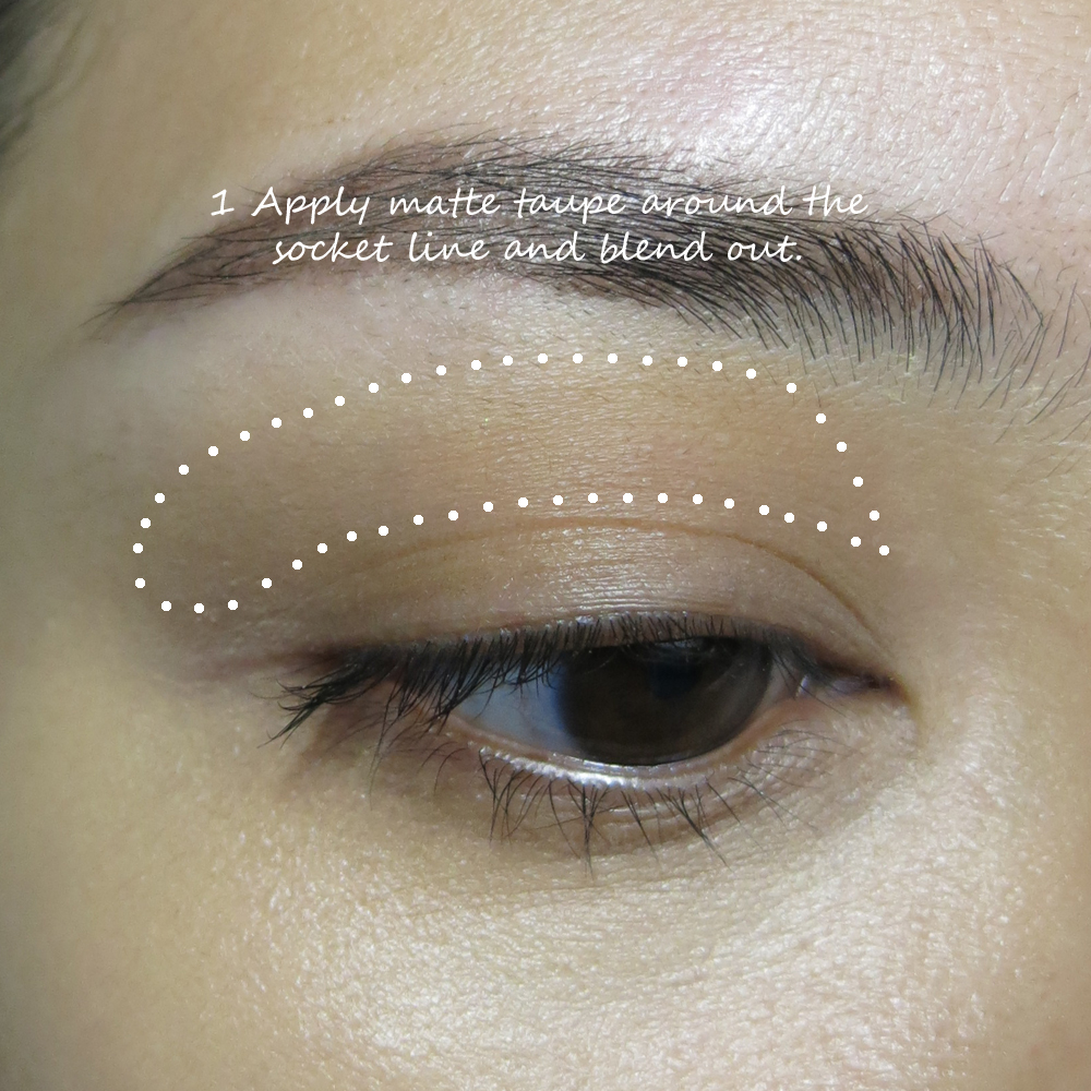
And now, with the swatching and quick review out of the way, here is the step by step to recreate that eye look!


On the cheeks, I am wearing 103, the petal pink blush.

For the lips, I wanted to keep things soft so the focus is on the dreamy teal eye, but at the same time I didn't want to remove the romanticism of the look by slapping on a nude lipstick, so I layered the deep raisiny shade 235 over a beige lip balm so there would just be a translucent stain of color, like you've bitten your lips.


Saturday, June 6, 2015

Bobbi Brown Shimmering Sands Palette Swatches, Review, and Demos (Day/Smoky Looks)


Bobbi Brown's launched their Summer collection, which includes the limited edition Shimmering Sands palette which a lot of people were very interested in when I posted images of it on Instagram. This palette is actually smaller than it might seem in pictures. My palette is a press sample, so the weight of each pan isn't printed on the bottom, but they are much smaller than a typical circular shadow so my guess is they're about 0.7g each or so, as compared to the typical 1.5g.

The good news is this is a very portable palette if you want something quite subtle and good quality, but not overloaded with too many full-size shades that you can't finish.


As you can see from the swatches above and below, there are a mix of textures, from sparkly to metallic, to satin, and matte. That said, there is only 1 truly matte shade and 2 satins that look mostly matte but contain tiny sparkles in them. A usual for Bobbi Brown shadows, I personally find the shimmers/metallics to be the smoothest and easiest to work with. The matte and satins are smooth but extremely subtle.

All the shades are pretty smooth, and pigmentation level is sheer to medium intensity. If you like Urban Decay and Make Up For Ever type intensity, you might find these quite subtle. But if you're more accustomed to MAC and Bobbi Brown shadows, then most of these are pretty good.

Both of the dark browns on the bottom right of the palette are actually those sparkly translucent creamy shadows that work better patted on over other shades. They also work alright on their own as a wash over the entire lid, but they won't work well as definer shades without eyeliner or a dark cream base, as they are too translucent and not nearly dark enough to shade and define.


Compared to the Spring Hot Nudes palette from earlier this year, I actually prefer Hot Nudes. I feel I get a bit more variety; cool, warm, matte, shimmer. While the shades in the Shimmering Sands palette are beautiful, there isn't a huge variety. You will find a single transition shade, and none of the colors are really deep enough or matte enough to make great liner/definer shades along the lash line.

But it's still versatile enough as a daily palette, and can give you some options for transitioning between day and night.


Below are 2 quick tutorials to demonstrate the possibilities to you. Do take note that the Smoky Look was done with a brown liner smudged lightly onto lids as a base. The metallic brown in the palette is nice but not as intense as this without a base.

DAY LOOK


 SMOKY LOOK


Monday, April 20, 2015

Yazbukey for Shu Uemura


Ottoman princess and jewelry designer Yaz Bukey has teamed up with Shu Uemura to create a whimsical and oddly cute collection this year, filled with pop colors and beautiful textures. Split into 4 specific personalities, the products are themed to coordinate and all packaged in identical colors.
  • Sexy Yaz - pink packaging
  • Smart Lola - green packaging
  • Romantic Betty - yellow packaging
  • Daring Tina - blue packaging

I don't have the full collection to show you; just a few pieces from each of the sets, including the key piece, the I Love My Shu Shu palette, which contains 7 ultra-smooth shadows and a blush shade.


The rich, warm, jewel-toned colors in this palette kinda remind me of the 6 Heart Princess's Black Princess palette from awhile back. There are no duds in this palette. The colors are all very silky and blendable.


The only thing is I would probably throw out those applicators in the palette. Especially the brush applicator. There's something which either looks like an overly long blender or a laughably small blush brush. Nah-uh. Chuck that and use your own brushes.

Also, most of the colors are actually matte or satin, so the textures are quite flattering and easy to work with. 

Aside from this, there are the  regular products like the cleansing oils, UV Under Base Mousses, and gel pencils done up in the seasonal packaging. I tell you - you will not be able to bear throwing out the boxes because they're half the charm. 


The expressions are just too cute.


Shu being Shu, there are also a couple of different collectible false lash designs. My favorite is this subtle pair of Yaz lashes, which are black interlaced with hot pink. There is also a pair of Tina designs which are spiky, jeweled strips. 

No less wearable, but more suited for night.

And seriously, don't they look darling in their box with the lip??!

Speaking of lips, there are 4 Rouge Unlimited Supreme Matte lip colors with the collection. A red for Yaz, a pink for Lola, orange for Betty, and a day-glo violet for Tina.


Now this shade really made my eyes pop because it's the one I'm most curious about.

As you can see the swatch below, it takes on an almost glowy blue cast, almost like the lipstick has a blue pearl (which it doesn't if you look at it up-close). Whatever colorants they used just picks up the light and throws it back blue. If you want a very lightweight color that is also extremely daring, look no further.


My main criticism for this shade is the fact that the Supreme Matte textures are that of the very thin, lightweight, new-generation matte lipsticks that can't really be built up to full opacity, so they have more of a tendency to go on slightly patchy, especially if you're wearing very dark or very pale shades.

You can see from my hand-swatch above. Trying to apply more will just wipe off what you applied below, so it's really not meant to be worn thick like MAC matte lipsticks.


 The shade is fun for sure, but if you have dry lips make sure you prep beforehand, because again - these lightweight matte textures are often actually less forgiving and conditioning than thicker traditional oil-based mattes. I didn't apply balm beforehand, and it just made the texture of my lips all the more obvious, although it's actually comfortable to wear. My guess is that the red shade would be the most forgiving of the 4.

There are also nail polishes in the collection, which I haven't had a chance to see myself yet,

All in all, this is a super-cute collection for those who don't like "typical cute stuff". It's very eclectic and quite sophisticated actually. And ultimately, it's a great way to step out of your comfort zone from the typical neutrals this season, what with a lot of the other high-end brands coming up with the usual neutrals, bronzes, and aquatic colors.


The Yazbukey for Shu Uemura collection launches 1 May in Singapore, but will be pre-launched at Tangs Orchard on 24 April! See the full collection on the Yazbukey for Shu site here!