Showing posts with label luxe makeup. Show all posts

Friday, September 9, 2016

Tom Ford Lip Contour Duos: Swatches, First Impressions and Top 3


Tom Ford's just launched his new Lip Contour Duos globally, and these are priced at $76 in Singapore, the same as the regular lipsticks.

These slim, sleek tubes come in the signature TF brown with gold details, and one end has a cap protecting the twist-up liner, while the other end has a detachable lipstick tube holding a creamy shade of the same color.

In a sense these are more of convenient lip-to-go duos comprising of matching liners and creamy lipsticks, rather than contouring products, which to me refer to products with shade and light, to alter the contour of features. These lipsticks and liners are pretty much the same shade; in fact the liners are a hair lighter than their companion lipsticks, so don't expect to create ombre lips or 3D lips with these.


That's not a problem to me. I personally don't like the look of a dark lip line, and when it comes to ombre lips I usually play with tone (rosier in the center, more neutral around the outsides) rather than dark and light.

The formula of the lipsticks is extremely smooth and creamy; super comfortable to wear, as you would expect from a lipstick that is this price. Coverage is pretty good; these are not sheer lipsticks. As for the liners, they are a creamy-matte texture and can work on their own as matte lipsticks, but be aware that they all contain a subtle sparkle and have flecks of gold in them, which I don't mind but find a bit curious.


They do an adequate job of preventing bleeding and smearing into lip lines.

If I have to pick just three shades, it would be 
  • 04 Show It Off - brown rose
  • 06 Devil Inside - orange-red
  • 07 Secret Escort - Maraschino cherry red
I do also really like 03 and 05, but as far as neutrals go the deeper rosier browns are more my style (and just more flattering in general), especially if you like the brown-rose 90s lip. And for the brights, I think 06 and 07 are really vibrant and especially pretty.

08, the deep plum would be the only shade I find somewhat patchy compared to the rest. It's a deeper color, and the formula is not quite able to build up to opacity without a full layer of lip liner beneath. Which is fine since there is a matching liner. But I would rather a $76 lipstick not require me to apply a full layer of liner as a base if I don't feel like it.

Sunday, April 3, 2016

Natasha Denona 28 Palette Swatches and Overview


Natasha Denona is one of the new "It" brand among makeup afficionados, and one of their hero products is the 28 pan shadow palettes, which come in just 2 variations - Green-Brown, and Purple-Blue.

These are pricey - let's get that out of the way - each palette is US$239 - which may be a little too much to splash out at one shot if you're not sure about the quality and the type of shades that you're getting. But if you're building up your collection or you just love colors and variety in general, the fact is you're paying a little over $8 per shade, and with 2.5g of product per pan (a typical MAC pan has 1.5g) it's actually really good value for money if you will use a majority of the shades.

Otherwise, the purpose for my post is also for you to take note of individual colors that perform well and that you might especially like, because Natasha Denona shadows are available in singles, as well as 5-pan and 10-pan palettes, although you won't get each color at the same price of course.

Each palette is not plastic, but made of a sturdy padded magnetized "foam" that does absorb a bit of shock and reduces the chances of your shadows shattering during transportation. The bad thing about this is they are also quite a lot heavier than typical plastic palettes, if you're having to carry a lot of things around in your kit.


Quality and Pigmentation

For the most part, the shades are great quality. Highly-pigmented and smooth. But this also means fallout, which is normal for most brands.

I can't say all the shades are equally good though. Natasha Denona shadows are talc-based, so similar to other brands with talc-based formulas (think Morphe, etc) the metallics and pearls are outstanding; and the mattes tend to be a bit more inconsistent.

In the Green-Brown palettes, I would say the bulk of the shades are fair to great. There is maybe one matte shade (64V Shell) which is patchy and poorer in quality than the rest. But for the most part, you can use any one of the shades and be pretty confident it will perform well. As for the Purple-Blue palette, it's a lot less consistent. Several of the mattes (70P Cool Plum, 28V Electric Violet, 82V Nina's Orchid, and 24V Aubergine) are quite patchy and not as easy to work with if you want to build up intense color on the lids with these.


Colors

I have to say in terms of the color composition and choices, Purple-Blue is hands-down the winner for me. There are a lot more unique and wonderfully beautiful shades, including some incredible duochromes, and if you are going to be paying $239 for one premium palette, I wouldn't suggest going for the more "normal" Green-Brown since it's probably easier to find some comparable shades in other palettes and lines.

Then again if you want reliable quality and plenty of daily wearable options in one palette and don't already own lots of neutrals and warm tones, then Green-Brown would make sense for you, since there are a few more patchy, unpigmented "duds" in Purple-Blue, sadly. Still, I don't regret getting it because there are a lot more of the pretty shades.

And even with the Purple-Blue palette, there are a good number of neutral shades for you to "complete your look", if you don't want just purple and blue all over. Neither palette has a black, which I am fine with, because that's one of those utilitarian shades that I'd rather buy and restock separately in most cases.

For the looks below, I used several shades to try and test as many different shades and finishes as possible.

Green-Brown Look:

  • 64V Shell as transition shade in socket
  • 90V Sand storm in outer half of socket for warmth and dimension
  • 78M Umber in outer corners for depth
  • 14M Antique Olive in center of lid and along lower lash line
  • Mix of 86P Golden Aquamarine and 16M Emerald Green in inner corners for a cool-green contrast
  • 20M True Gold down the center of the lids for a pop of sparkle and shine on top of the Antique Olive shade
  • I also used a charcoal grey pencil as liner, and 15M Bottle Green just on top of the liner in outer corners of my eyes for some depth

Eye look done using the Green-Brown 28 Palette


    Purple-Blue Look:
    • I applied navy blue pencil along the upper and lower lashes first, then applied shadows over top for a subtler, more pearlescent liner effect.
    • 80M Piggy over inner half of lids
    • 11V Steel Blue blended softly into socket line for subtle shading
    • 05M Calypso Blue over outer half of lids (this gorgeous duochrome shade also "transforms" the look of the pencil and the matte socket shading beneath)
    • 11M Metallic Steel Blue over the pencil to bring out more blue in the liner
    • 04M Chromatic for a metallic platinum sparkle down the center of the lids
    • 52M Golden Beige over entire brow bone area for a golden-peach contrast to the cool-toned look

    Eye look done using the Purple-Blue 28 palette


    Conclusion?

    These are definitely worth checking out if you're a makeup fanatic.This is a great new line to try, and while the formulas aren't earth-shattering in any sense, it IS pretty good value.

    If you're just starting out however, I might suggest going with cheaper lines just to stretch your dollars a bit before you commit to something as pricey as these. And you know yourself - if you're likely to use the same 4-5 colors daily and don't often veer out of your comfort zone, then it's really not worth buying a large palette anyway.

    I will probably get more daily use out of the Green-Brown palette as a whole but there are some shades that are so great in the Purple-Blue palette that I would say it's still worth checking out if you're more of a cool-toned gal.

    I do definitely recommend checking out some individual shades like 05M Calypso Blue, 01V Navy, 60M Golden Rose, and a whole range of the other metallics in this palette, if you don't want to get all 28 including the patchier shades. But just do your calculation, cos if you're getting a fair number of single shades, it might add up to the same amount as (or more than) the 28 palette, in which case you might as well just get the whole palette, duds and all.

    Sunday, February 14, 2016

    NARS Velvet Matte Skin Tint


    I really enjoy NARS' regular Skin Tint as a daily sheer base, so when I heard they were launching a Velvet Matte version that was really exciting for me.

    With this release NARS promises:
    • effortless application
    • soft matte soft-focus finish
    • soft-touch feel
    • antioxidant defense
    • shine and pore control

     I've worn it on and off for over a month, and I'll say:
    • effortless application - yes, this does glide on and blend out beautifully. I always use fingers to test new foundations (it's the one universal tool most of us have), and this takes minimal effort to smooth out
    • soft matte soft-focus finish - if by that you mean satin and non-greasy looking but not a flat powdery matte, then yes; this does leave the exact amount of sheen I like, and creates a very smooth and youthful glow without emphasizing pores, but I would class it as a satin rather than full-on matte finish. It might simply be due to the fact I live in the tropics, but a matte foundation isn't really matte if it only looks matte in dry climates, ya?
    • soft-touch feel - yes, once it sets this leaves skin feeling velvety smooth, non-tacky, and does not transfer to your fingers when patted
    • antioxidant defense - this contains vitamins C, and E, which is great for providing a bit of extra daily protection. The SPF30 PA+++ also helps if you live in a non-tropical climate without a lot of direct sun.
    • shine and pore control - this does a fairly good job for dry and normal skins in hot weather, and I expect it will be pretty good on combination skins in cooler, drier climates as well. However if you are very oily AND live in a hot place, you will probably get some oil break-through in a few hours. Fair enough, because I always recommend you blot it away than try to find a product that absorbs 6-8 hours worth of oil, and leave it all sitting on top of your skin.
    With this skin tint, it does respond to what you use beneath so if you wear a matte primer it will take on a slightly more matte finish. And if you use a dewy product it will take on some sheen. Unlike some really matte formulas it will nor take down shine and change the finish of your skin dramatically. 

    The coverage is medium-light, meaning you definitely cover a lot more than typical tinted moisturizers which barely even the skin out. It will even out mild discolorations. However if you want more coverage, you CAN build it up to almost a medium coverage by tapping on a bit more product where you need coverage. This is where I would suggest using fingers rather than a brush or sponge, which will just lift a lot of the product away.

    I am using Alaska (I'm MAC NC25) and didn't notice any oxidation or darkening over the day. However I do have to say I tend not to experience much oxidation in general so I would try out a sample if your skin chemistry tends to oxidize many foundations.

    Bare skin
    NARS Velvet Matte Skin Tint with no concealer or powder

    I don't have the full box in my review kit, and I couldn't find the ingredients list online yet, but I didn't detect any fragrance. If it's there at all, it's extremely mild. I have semi-sensitive skin and this did not give me any breakouts or sensitivities with use. It DOES condition and smooth my skin a little - and while it can't really hide flakiness, it doesn't emphasize them overly either. 

    Overall, I do really like this for everyday wear. You get enough coverage to look and feel like you spent time on your skin, and it leaves that polished "expensive skin" glow around the high points of your face, which I prefer to a fully matte powdery foundation. It looks like more perfected, clean, moisturized skin. Not makeup. However this means it's not really "matte" matte, so if you have bumpy, uneven and blemished skin, you will need a lot of matte powder to hide the texture if you want to use this. It probably will not provide enough oil-control for very oily girls either. 

    Lasting power is fairly good if you're in air-conditioned environments or a fairly cool place for the most part. But I do find it can break down a bit if you are running about in the heat. This is not one I would personally pick for a full day of running about in Summer or tropical heat. Then again - most foundations can't hold up under those conditions.

    The one thing I find a bit lacking is sun protection.
    While SPF30 PA+++ is alright for those in cooler climates or with tan to darker skins, it really isn't enough protection for Summer, lighter skins, or anyone living in tropical areas. That's fine for me because I usually wear a separate sunblock (the amount of foundation we apply usually does not give us the maximum sun protection listed on the packaging anyway), but don't assume SPF30 PA+++ is enough. 

    If you have light skin, SPF30 only gives you 60-90 mins of protection. That's 1.5 - 2 hours. Enough for a quick run to the grocery store. And PA+++ is adequate but PA++++ is required for optimal UVA (anti-aging) protection.

    Still, this one thing is not a big enough point to say don't try this foundation. I think it's a great product for combination, normal and slightly-dry skins, and as long as you exercise basic skin wisdom and wear a separate sun screen or avoid too much sun exposure, it's great.

    Launches in Singapore in March 2016.

    Saturday, February 13, 2016

    Diorsnow "Bloom Perfect" Perfect Moist Cushion - A First Look!


    Dior brings out new Diorsnow products around Spring of each year, and for 2016 it's their own interpretation of the eponymous Cushion Foundation which has started invading all the Western brand line-ups after several years in Asia.

    Like Chanel's Le Blanc, Diorsnow is a "whitening"/brightening line created originally just for the East Asian market, where there is an eternal obsession with luminous, unblemished skin with no trace of sun damage. Many people around the world are only just learning about how bad sun exposure and photo-damage actually is on the skin, but it's always been a big deal in East Asia, and good formulas are expected to do double-duty - treat existing damage and prevent future damage.
    I will go out on a limb and say that good whitening skincare IS often great skincare for treating first signs of aging. I feel the separation of the two lines is more about marketing and selling more products to consumers. Most of the soothing, repairing, and protecting extracts and ingredients in whitening skincare - like stabilized Vitamin C, Licorice extract, or Edelweiss extract which is used in the Diorsnow range - also can protect against collagen and DNA damage.
    Dior's put their skincare ingredients into their latest foundation - the Bloom Perfect Perfect-Moist Cushion - which is an ultra-hydrating, protecting, and brightening foundation which promises to both treat as well as protect. If you've used and gotten good results with other skincare products in the Diorsnow range, you will be happy to know they also have two new skin priming products -  the Bloom Perfect Brightening Effect Skin Creator, and the Brightening Makeup Base, which I'll review separately.


    I was sent shade 020 in the cushion foundation for review, and it is available in Singapore in only 3 shades with neutral undertones (005, 010, 020,m). It costs SGD$105, comes in a box with two cushions (one in the case, one in a sealed pouch), and the standard issue application puff. I usually dislike all puffs aside from the new Shu Uemura flocked one which is ultra soft and doesn't soak up a ton of product. The Dior is slightly softer and more plush than the average Korean-style puffs, but it's still mostly the same and I still don't love it.


    On application, you get a light coverage, but as with most cushion foundations you can pat a bit more on over the first layer to build up slightly. I did find that the Dior does not build up to the level of coverage you get with most classic Korean cushions. The most you will get is light-medium at 2-3 coats. If you need to apply more than 2-3 coats of a foundation to get the coverage you want, you are using the wrong product.

    You can see in the before after below that it does even out my skin considerably. I am slightly paler on the brow bones and in the lower parts of my cheeks, and I have some uneven darkness around the mouth and chin, eyes, nostrils, etc which (aside from making it look like I permanently wear brown shadow) can make my face look slightly deeper than my neck. I usually use 021 (medium-light yellow) in Dior foundations and 020 is slightly more neutral/pink than my skin


    It does give enough coverage to cover broken veins and old marks from spots, but I had to tap my finger in the product and pat it gently on specific areas where I want more coverage. Brushes, sponges, and puffs will always take some product off. For max coverage, fingers are the best.

    (And before you cringe, remember it's a hundred times easier to ensure your finger is sanitized, than a used brush or sponge.)

    PROS:

    • A good strong dewy glow
    • A light feel
    • Very fine texture on the skin; doesn't look heavy or unnatural
    • Good SPF
    • Skincare ingredients
    • Puff is a bit softer and easier to work with than many other puffs around

    CONS:

    • Too dewy for girls with bumpy, uneven skin or large open pores
    • Only gives light-ish coverage
    • Will not lock on and stay on in humidity or on oily skin - this will rub off and transfer quite easily
    • Not enough PA (UVA) protection - I feel on principle every product that has SPF50 should have PA++++, because many people get a false sense of security from using a "50" and think they can skip sunblock, when in reality they are not getting maximum protection against aging UVA rays
    • Not enough shades for deeper skin tones - 020 is around N2 for MAC. Diorsnow is a line created primarily for fair-skinned Asian consumers (Japan is a major market)
    • Heavily fragranced

    So - same story with pretty much every other cushion foundation I tried - they will not really set and lock on and stay intact the entire day if you are oily, or running about in humidity and sweating a lot. Don't even think of using this if you have oily, blemished skin because it makes my semi-dry/normal skin look a bit greasy after 30 mins even with setting powder. You can apply a ton of powder to try and make it last longer but I don't see why you would get a dewy foundation if you are just going to matte it down. Wear it if you have relatively smooth skin, small pores, and just want something to add a youthful glow, hydration, and to even out the skin for a couple of hours. 

    My biggest beef with this product is the lack of lasting power. I let it sit for a couple of minutes and then pressed a sheet of tissue very, very gently onto my skin. It came off with a LOT of product.

    That's not to say I hate this product. It's exactly what I expect of a cushion foundation, honestly. This is a very fine formula, smells lovely, feels luxurious going on, and has some sun protection and skincare. I just don't love cushions in tropical climates to begin with. If you need something that stays intact all day and can withstand heat and grease or hide large pores, you might want to try the regular Diorsnow foundation, which has amazing coverage, similar sun protection, and a semi-matte finish that will last a lot better.

    The Bloom Perfect Brightening Effect Skin Creator on the other hand, is a silky pre-makeup salve which feels lovely and imparts a subtle smooth glow to the skin. I am very excited about, and will post more info after a bit more testing.

    Wednesday, December 23, 2015

    Clé de Peau Beauté Collection Bal Masqué 2015 Makeup Look


    Clé de Peau Beauté always does beautiful holiday collections. This year's Collection Bal Masqué is a take on mysterious glamour with lush velvet colors accented to burnished metals. Think burgundy, red, olive, gunmetal silver, and gold.

    I can just swatch it - but it's always better if I can do an entire look to show you how everything goes together.

    It's quite a full-on look - you need to be comfortable with wearing smoky eye shades with Extra Rich Lipstick in that beautiful blue-based red, No 314. Then again, you can always wear them separately or go easy on the shadows and wear them with a light hand. But this is the time of year when I think you can stop worrying so much about being "too glammed up" and just go for it.

    The gorgeous Venetian inspired Eye Color Quad 314


    (If this isn't in your budget, you CAN dupe most of the eye colors and the lip color. Just for reference MAC's Sumptuous Olive, Gold Mine, Silver Ring and Black Tied would give you a somewhat similar eye look - but remember that MAC shadows are heavier in formula and quite a different texture, so you should use a very light hand if you want to get a similar effect. M.A.C. Red lipstick is also very similar to 314.)

    The other star product from the collection is the Body Powder. I was surprised to see the name because I'd instantly thought - cheek highlighter! But once you swatch it you realize why. There are obvious specks of micro-glitter running through the powder, so it won't work as a daily highlighter for a dewy/glowy look. This is a party powder.


    From a distance it looks like strobed skin, but up close you will see all the glitter particles. That's why I consider it a special occasion powder if you want to use it on your face. And avoid the inner cheeks because it can emphasize pores. On the collarbones, shoulders and arms this would also be gorgeous of course.

     
    And I have to say - that compact is just unbelievably gorgeous. I know fans who buy it simply to collect.


    Too coordinate with the makeup, there is a trio if nail lacquers that come in a set. The formula is ultra-smooth and you can get away with wearing a single coat if you are in a hurry because they go on so pigmented. 

    I was not expected that dark scarab-green metallic (No 2) to be my favorite but it's beautiful. 

    EYE LOOK BELOW

    Sunday, September 6, 2015

    Dior Addict Lipstick Fall Relaunch Review and 4 "It" Shade Swatches

    Dior is relaunching its Dior Addict Lipstick range this year, and besides a new "Hydra-Gel" Topcoat to help seal in color for longer, and a Triple Oil Complex at the core (where the "CD" logo runs down through the entire lipstick) to smooth and plump lips, they've also updated the colors to fit current fashion trends, and also increase shine.

    These are translucent balm-like hybrid lipsticks with a variation in cream, shimmer, and pearl finishes. While they certainly do last longer than old-school tinted balms from 5-10 years ago, these are still creamy sheer lipsticks that will come off on cups, tissue, and someone's cheek quite easily. Balms will be balms, so let's not harbor any unrealistic expectations. 

    On the other hand they are very comfortable to wear. Some of the sparkly shimmer formulas may feel just a touch more gritty on the lips than the creme and pearl formulas but they are in no way rough or uncomfortable on the lips. I actually did not find these as glossy as I had expected given the description of the Triple Oil Complex and the promise of shine. They do take on a bit of sheen as the soft hydrating formula warms up on your lips, but these are not ultra-glossy by any stretch.

    Color-wise, as with many sheer balmy shades, many of the soft colors will look pretty similar to one another so you would have to go with some of the brighter or deeper shades if you want color impact. There is almost no point owning more than 1 or 2 of the soft pinky/nude shades at a time. Also, if you have pigmented or dark lips, some of the paler shades can look ashy and patchy, so I would again go with the deeper options.

    By now you might be thinking I actually dislike the product. Not so!
    I do love a good balmy tinted product that I can throw in my purse and whip out without a mirror for a touch of color without having to worry about making a mess. And these do feel really nice on the lips. Not patchy, sticky or oily. 


    Dior is featuring 4 shimmery, pearlescent "It" shades this season, and the one that immediately caught my eye was Be Dior, the raspberry fuchsia. It  might look dark and scary in the tube for some of you, but remember these are sheer. You will see in the swatches below that it will just look like a nice berry stain on the lips.


    553 Smile - nude pink creme; brightens and evens out the lips slightly
    451 Tribale - soft coral pearl; nice and flattering with slightly buildable color
    561 Wonderful - petal pink shimmer; the most sparkly of the 4 "It" shades
    976 Be Dior - raspberry shimmer; flattering rosy berry with subtle sparkle


    My favorite shades from the 4 are probably 451 Tribale and 976 Be Dior (UPDATE: yes, this is the shade Jennifer Lawrence wears in the Shine, Don't Be Shy ad; it's a beautiful color, although the actual shade is not quite as violet as it sometimes appears on screen), although 553 Smile is a versatile "throw in your bag" nude-pink that you can just throw on as a balm anytime. 561 Wonderful is pretty if you like a sparkly baby pink, but I personally don't go for this type of shade too often as they make my lips look a little grey. If you have a lot of natural pink/red in your lips (as opposed to no pigments or brown pigments), this would be pretty for softening the color and adding a spun sugar effect.

    All in all, it's still a great range of casual, fashionable colors to throw on for those who want soft color but don't like the stickiness of gloss or the feel of heavier lipsticks. I would compare these to the YSL Rouge Volupté Shine range in terms of the payoff and finish although the YSLs are a bit more glossy in finish, and these come in a lot more shimmery pearlescent shades. I'm still a die-hard Diorific Lipstick fan (I just love the intensity and drama), but I do always keep an "easygoing" product in my purse for occasions when my lips are feeling ragged and I can't deal with the maintenance of a strong lip.


    Dior Addict lipsticks retail at SGD$48 at all Dior beauty counters from 1 Sep 2015.


    Sunday, July 5, 2015

    Satiny-Neutral Daily Look Tutorial: Tom Ford Nude Dip


    I was requested to do a tutorial using the Tom Ford Eye Color Quad in 03 Nude Dip. 
    This palette is different from all the other regular ones in terms of formula. The textures of the 4 shades are a lot more silky and pearlescent, whereas the original palettes were composed of more powdery satin and sparkle shades.


    These 4 shades are highly metallic and at first look - similar to Japanese eyeshadow formulas. However, those are very sheer. The Nude Dip formula is translucent but also much more pigmented and buildable. 

    You get a golden-ivory, a tawny shell-pink, a taupe, and a chocolate brown shade.

    Below is a simple tutorial using all 4 shades, although I do often use just 2-3 shades for daily looks.


    This is a very subtle palette and the colors all blend seamlessly together. But I would say you shouldn't expect dramatic variations in looks because the shades are all pretty soft and neutral. You will get lovely dimension and a beautiful gleam to the lids though.

    If you're a fan of shimmery shades, this is a PERFECT wedding palette.

    As with most of Tom Ford's formulas there is minimal fallout (there will almost always be some with most shadows but his has some of the least), and the colors and textures are flattering even for mature lids. This palette is more pearlescent though, so if you have a lot of lines on your lids, it might not be the most flattering palette for you to pick out of his range.


    I still highly recommend it though. I have a few other faves in the Eye Color Quad range, but this is definitely up there with Cognac Sable and Lavender Lust among my absolutely must-haves.

    This used to be a limited edition palette but good thing they've decided to make it permanent.


    Monday, June 22, 2015

    5 Favorite Neutral Eye Palettes: Jan - Jun 2015

    I'm a huge fan of neutrals, obviously, and I have a ton, but I figured I should narrow things down and just feature 5 of my absolute favorites - the ones that are not only in permanent collections (no limited editions!) but that I would pick over the others for various reasons.

    And no - there isn't a single Naked palette in here because nobody needs another post about a Naked palette!


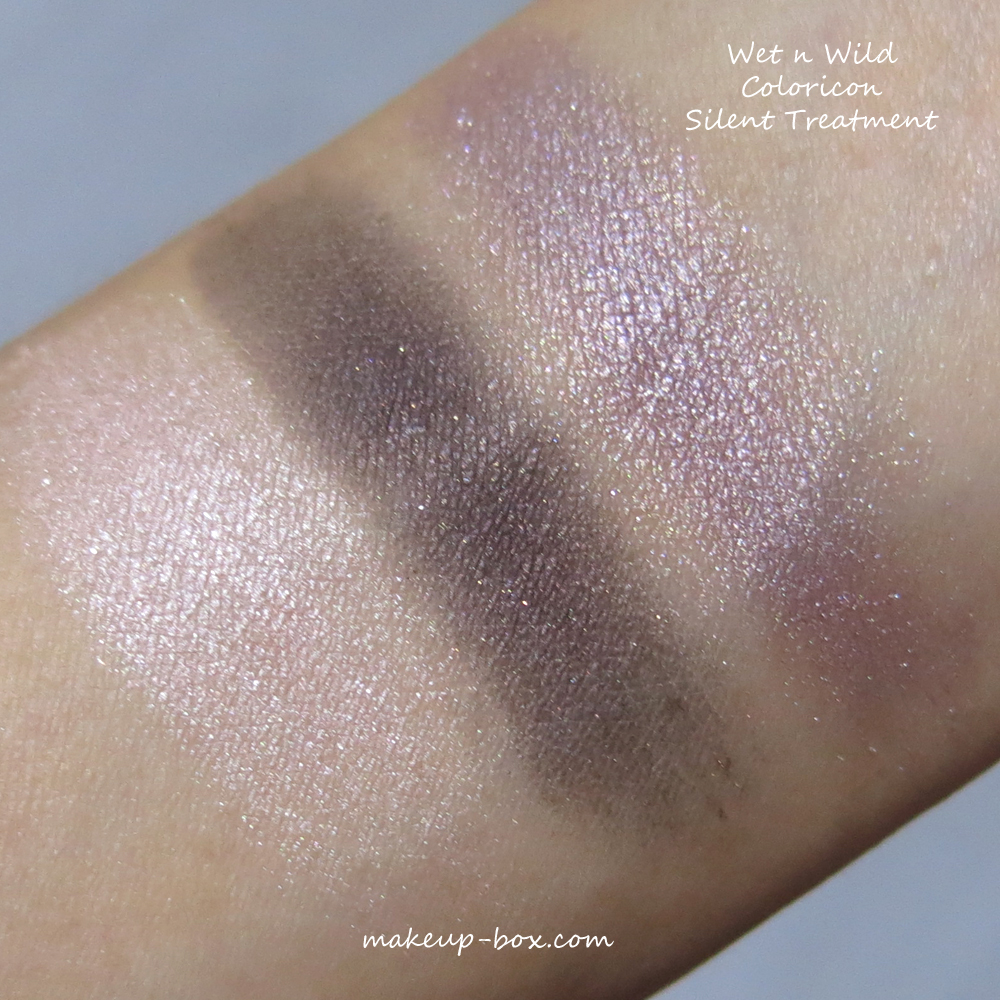
    Wet n Wild Silent Treatment Trio - Budget/Drugstore

    This one I've loved for a few years now and forgot about it until I did a clean-out and rediscovered it earlier this year. Not only is it cheap as chips, the quality and color combination are absolutely outstanding. A little powdery and crumbly maybe, but that's small price to pay.
    That metallic taupe is one of the most gorgeous shadows around, and I'd say the palette is worth the price just for that shade alone, although the other 2 shades are pretty good too.


    Sephora Colorful 5 Pale to rich taupe palette - Mid range

    With the exception of the dark matte shade, which takes a bit of effort to build up in intensity, this palette is BEAUTIFUL quality. In fact I would say the pearlescent shades are actually equal in quality to high-end Dior or Marc Jacobs palettes.
    The palette isn't much to look at packaging-wise, but the product itself is great and can take you from subtle day looks to dramatic smoky or sparkly looks as well.


    Dior Eye Reviver Illuminating Neutrals palette 001 - High-end

    Dior has several neutral palettes, including the very beautiful Cuir Cannage which I have a deep love for. But if you have to pick just one, I believe the Eye Reviver palette gives you more options for the price because it's got a matte base shade, and a gel liner as well.
    I'm not a huge fan of having cream/gel products in the same palette with powders, but even if you ignore the liner, there are 5 beautifully creamy powder shades. Definitely a worthwhile investment in my opinion.


    Tom Ford Eye Color Quad in Cognac Sable - Luxe

    Tom Ford quads are - in Singapore - some of the best high-end shadows to invest in considering how much product you get for the price, high though it might be. The colors are all tastefully assembled and the textures are ultra flattering even for mature eyelids. Plus, they are very silky and have minimal fall-out.
    I've loved almost every single Eye Color Quad I bought but my favorite warm palette has got to be Cognac Sable. Golden Mink is pretty but in terms of versatility, it loses to Cognac Sable, because this is a palette where you can get away with putting any single shade all over your lids, and you would be able to get 4 completely different effects, from soft to sparkly to smoky to dramatic.
    With Golden Mink, the differences between the shades aren't that apparent compared to Cognac Sable.


    By Terry Eye Designer Palette - Luxe

    I probably don't need to say too much about this 10-shade matte palette because I have a full post with swatches of every single shade right here. You definitely don't need to spend so much on a neutral palette when there are many other options around, but if you're in the market for a splurge that is as practical as it is luxurious, this is it.