Showing posts with label colorful makeup. Show all posts

Wednesday, August 24, 2016

Urban Decay Moondust - a sparkly obsession


I must admit when I first saw a visual of the new Urban Decay Moondust palette online my heart started going a hundred miles a minute. Sparkle - yass!
If you're like me you'll be happy to know that I personally think they rock.

Urban Decay Moondust palette contains all-new shades in their Moondust formulation, a silicone-based glitter shadow formula made up of synthetic mica, similar to sparkly shadow overcoats you find from brands like Tom Ford and Shu Uemura.

Urban Decay Moondust palette swatches
The typical way to wear these is to layer them over other shadows as a glittery topcoat for your lids. On their own, they can look like a sheer wash of sparkle, or when they are pale, like gleaming "wet" lids. You apply them with fingers - this is important - not a brush. Because the formula is made to cling to skin, not bristles.

That is - until you wet them.


This is orgasmic.

They look like foiled shadows or stuff you might find from Colourpop. Mucho intensity.

So I decided to apply them all damp for the most intense effect, because I want to do a look using nothing but Moondust shadows. I didn't want to layer them over other shadows or you wouldn't be able to see how they really look.


Can we say BLING?!
If you plan to use them in a more subtle way, just dab on with a finger. These shadows are formulated with silicone in the base, and designed to stick to skin, not brushes, when dry. So don’t complain about there being no pigmentation if you try to dust them on with a dry brush. Damp, these are incredible foiled shades with plenty of duochromatic magic. Every shade has a different color shift when it hits the light. Click each image to expand or right click and “open image in new tab” to see everything in higher res.

Do expect plenty of sparkly fallout though. More than if you rubbed these on with a finger, ironically. So do your foundation AFTER you do your eye makeup. I don't think it's a big deal though.


Thursday, February 11, 2016

S/S 2016 Makeup Trends and A Chat with MAC Cosmetics Senior Artist Louise Zizzo

Louise Zizzo, M.A.C. Cosmetics' Senior Artist was in Singapore recently to showcase the Spring/Summer 2016 Makeup trends, and along with taking a look at the runway looks of the season (plus some face-chart fun), I was lucky enough to score a quick interview with her.

M.A.C. Senior Artist Louise Zizzo applying lashes on a model

How would you sum up the key looks for S/S16 in one sentence?
Louise: The key looks for SS16 are deliberate, decisive, playful and have a modern sophistication to them.


What are some of the key trends that you expect to extend throughout the whole of 2016, beyond SS?
Louise: The bold lip trend and no-makeup makeup.

Desigual's S/S16 modern retro look with matte orange-red lips, clean skin and black liner

I often feel a lot of modern makeup we see on social media today is actually 50's makeup transposed onto a different color palette. Strong, defined arched brows, overdrawn lips, strobing and sculpting... as a fan of glamorous retro makeup yourself, why do you think these trends keep coming back?
Louise: You are quite right the makeup we see on social media today is based on old school techniques but I think because it is such a process - it gives a feeling of glamour and it can transform you into a completely different looking person. It's playing dress up but for the face!

What are some of the strongest makeup influences/inspirations for you?
1920's, 70's, 80's decades (especially the 80's - that's when my love affair with makeup really began as a teenager).

Colored winged liner at Moschino S/S16


You said once that makeup should be approached with "intention rather than habit". I love that - but for the benefit of the readers, could you elaborate on it?
Louise: We are creatures of habit by nature and it is very easy to apply let's say highlighter because it's trendy and everyone is doing it or someone told us to do it, but our face tells its own story and we know it best, so ask yourself why am I applying this highlighter, where do I actually need it and what is it doing for my features? Another example is concealer, just apply it where you need it - which isn't necessarily all under the eye - perhaps you just need a little in the corners.

What is in your makeup bag right now?
Louise: Plushglass in "Fulfilled" - my fave! Mineralize Skinfinish Natural and Lip Conditioner.

If you were not a makeup artist you would be.... 
Louise: An interior designer.

Thank you Louise!


M.A.C. Spring/Summer 2016 Face Charts

Sunday, January 3, 2016

MAKE UP FOR EVER Spring 2016 9 Artist Shadow Palette #3


I’m a big fan of the MAKE UP FOR EVER shadows because they have this very intense, creamy feel although I don’t always recommend them for newbies because the pricing of single shadows leans on the high side. So when they came out with the first neutral 9 Artist Shadow Palette for just SGD$69 it was a bit of a dream come true.

For 2016, they are releasing a limited edition Spring palette filled with fresh soda-pop colors. If you love colors in general, and want a mix of soft and strong ones, this is a more wearable alternative than Palette No 2 (limited edition in 2015), which leans towards strong, acidic tones.


This is a fun purchase to add to your collection if you already own some neutrals. There are lots of dusty pastels you can use for soft, sweet looks, and also some options for intense, bright peacock colors.

I especially love the gorgeous coral shade in the center, which has an iridescent gold glow. And the column of purples on the right make a beautiful trio.


This probably isn’t an item I recommend as a “first palette” purchase because you probably need a few neutral/matte shadows (brown, black, grey, etc) to use as transition and definer shades in the socket and along the lash line. That’s optional of course - if you like colors in the socket and along the lash line just go for it.

The most obvious way to wear the shades is to group them in columns top-down, and they look beautiful that way, but don't feel restricted to this. In fact, I would even suggest seeing this as a palette filled with single shadows - not necessarily that you need to create an entire look from within the palette. You also get 9 x 1.5g shades (each a full-size MAC shadow) for SGD$69 - which is incredible value considering you usually can't even get 2 full-size MUFE shadows for the price.

I did 3 different eye looks below using shades in the palette, and it's just a reference for how you can pick/pair colors, and also supplement your look with a matte color in the socket or dark pencil smudged along the lashes as a base to add dimension and definition.

Tuesday, July 21, 2015

Clé de Peau Beauté Fall / Winter 2015 Collection: La Beauté Vénitienne


Cle de Peau Beaute's F/W 2015 Color Makeup Collection is inspired by the waters jewel-toned colors of Venice, and plays with light and shadows to create hazy, yet impactful colors.

There are a total of:

  • 3 quads - 311, 312, 313 (SGD$80 for each, $30 for the refillable case)
  • 5 Powder Blush Duos - 101 to 105 ($68 each, $40 for refillable case)
  • 10 Enriched Lip Luminizers - 227 to 236 ($80 each, $30 for the refillable lipstick holder)
  • 2 Bronzing Powder Duos - 1 and 2 ($130)

The showcase item for the collection is probably the Eye Color Quad in 311, which pairs gossamer cool neutrals with a deep, luxurious teal that's a perfect cross between green and blue. Cle de Peau's not usually the brand one turns to for outlandish strong colors, so I was quite surprised when I saw this palette.


But if you're worried about the colors looking garish, don't worry. There is only that one single shade that is a bit stronger, and the rest are like veils of shimmery fabric. The teal you can apply as an accent just along the lash line to add a bit of interest to a neutral look, OR you can do what I did and wear it stronger as a lid shade.


I personally love those blush duos. The colors look soft but you can get quite a good intensity if you pack it on with a good brush, so don't go overboard. I like swirling both the more intense and the more pearlescent shades together because the combined color is just more luminous and pretty, and add a "lift" to the cheeks. You can try to wear them separately, but I personally feel there isn't enough of a visible difference in tone between the 2 shades to warrant the effort.


The Enriched Lip Luminizers are great if you have dry lips or want an ultra luxurious balm-stick for daily use. They come in a mix of creme and shimmers. I'm just not sure I would rush out to purchase more shades because I for one go through these lip butter type lip products extremely fast, so at $80 a pop for just the refill, these can be quite a heavy investment if used frequently.

Also, an interesting thing to note if you didn't know, is that unlike the regular lipsticks, or most of the CPB products where you can get away with just buying the refill if you want the quality and colors, but don't want to shell out for the refillable packaging, these Enriched Lip Luminizers can't be used without the $30 lipstick case. There's a little click mechanism in the case that twists the lipsticks out of the tube. Without the case, you can't twist it. Just thought I should let you know!

In the case of lipsticks though, I would say just go ahead and invest in at least 1 case, if you intend to buy the colors. This is the one item aside from powder that you bring out to touch up, and without the sturdy, elegant, midnight blue case to keep it securely capped in your bag, you might end up making a very expensive mess.

The only products I have not featured in this post are the 2 bronzers, which I want to write about separately.

And now, with the swatching and quick review out of the way, here is the step by step to recreate that eye look!


On the cheeks, I am wearing 103, the petal pink blush.

For the lips, I wanted to keep things soft so the focus is on the dreamy teal eye, but at the same time I didn't want to remove the romanticism of the look by slapping on a nude lipstick, so I layered the deep raisiny shade 235 over a beige lip balm so there would just be a translucent stain of color, like you've bitten your lips.


Monday, April 20, 2015

Yazbukey for Shu Uemura


Ottoman princess and jewelry designer Yaz Bukey has teamed up with Shu Uemura to create a whimsical and oddly cute collection this year, filled with pop colors and beautiful textures. Split into 4 specific personalities, the products are themed to coordinate and all packaged in identical colors.
  • Sexy Yaz - pink packaging
  • Smart Lola - green packaging
  • Romantic Betty - yellow packaging
  • Daring Tina - blue packaging

I don't have the full collection to show you; just a few pieces from each of the sets, including the key piece, the I Love My Shu Shu palette, which contains 7 ultra-smooth shadows and a blush shade.


The rich, warm, jewel-toned colors in this palette kinda remind me of the 6 Heart Princess's Black Princess palette from awhile back. There are no duds in this palette. The colors are all very silky and blendable.


The only thing is I would probably throw out those applicators in the palette. Especially the brush applicator. There's something which either looks like an overly long blender or a laughably small blush brush. Nah-uh. Chuck that and use your own brushes.

Also, most of the colors are actually matte or satin, so the textures are quite flattering and easy to work with. 

Aside from this, there are the  regular products like the cleansing oils, UV Under Base Mousses, and gel pencils done up in the seasonal packaging. I tell you - you will not be able to bear throwing out the boxes because they're half the charm. 


The expressions are just too cute.


Shu being Shu, there are also a couple of different collectible false lash designs. My favorite is this subtle pair of Yaz lashes, which are black interlaced with hot pink. There is also a pair of Tina designs which are spiky, jeweled strips. 

No less wearable, but more suited for night.

And seriously, don't they look darling in their box with the lip??!

Speaking of lips, there are 4 Rouge Unlimited Supreme Matte lip colors with the collection. A red for Yaz, a pink for Lola, orange for Betty, and a day-glo violet for Tina.


Now this shade really made my eyes pop because it's the one I'm most curious about.

As you can see the swatch below, it takes on an almost glowy blue cast, almost like the lipstick has a blue pearl (which it doesn't if you look at it up-close). Whatever colorants they used just picks up the light and throws it back blue. If you want a very lightweight color that is also extremely daring, look no further.


My main criticism for this shade is the fact that the Supreme Matte textures are that of the very thin, lightweight, new-generation matte lipsticks that can't really be built up to full opacity, so they have more of a tendency to go on slightly patchy, especially if you're wearing very dark or very pale shades.

You can see from my hand-swatch above. Trying to apply more will just wipe off what you applied below, so it's really not meant to be worn thick like MAC matte lipsticks.


 The shade is fun for sure, but if you have dry lips make sure you prep beforehand, because again - these lightweight matte textures are often actually less forgiving and conditioning than thicker traditional oil-based mattes. I didn't apply balm beforehand, and it just made the texture of my lips all the more obvious, although it's actually comfortable to wear. My guess is that the red shade would be the most forgiving of the 4.

There are also nail polishes in the collection, which I haven't had a chance to see myself yet,

All in all, this is a super-cute collection for those who don't like "typical cute stuff". It's very eclectic and quite sophisticated actually. And ultimately, it's a great way to step out of your comfort zone from the typical neutrals this season, what with a lot of the other high-end brands coming up with the usual neutrals, bronzes, and aquatic colors.


The Yazbukey for Shu Uemura collection launches 1 May in Singapore, but will be pre-launched at Tangs Orchard on 24 April! See the full collection on the Yazbukey for Shu site here!

Thursday, February 5, 2015

VDL Candy You Makeup Swatches


Hip Korean beauty brand VDL's Spring 2015 makeup collection is called Candy You, and features 2 bright matte lipsticks (SGD38) and an eye quad (SGD58) in shimmery spun sugar colors.

The Expert Color collection is VDL's premium makeup range, and tends to feature richer pigmentation and stronger colors, which explains the higher price compared to their more affordable general line of makeup.


The palette is Expert Color 09 Rainbow Popsicle. A very fitting name for the translucent sparkly tones.


It's not the most pigmented quad from the line by any means, but the look is mean to be translucent and girly anyway.

I would pair these with a brown liner just for a bit more definition, although that brown shade is rich enough to define the socket and lash line in most cases. I would DEFINITELY recommend pairing the pale shades with a deeper one at the lash line (so don't wear them alone). Otherwise you can look a bit puffy and rabbity, as with cases where you're wearing a lot of pale shimmery colors together.

The lipsticks on the other hand, pack a lot of wow.

The Expert Color Lip Cubes are one of my favorite Asian lip color lines around, for the intensely saturated color and long-wearing performance. Now they've come out with Lip Cube EX, and the 2 shades in the Candy You range are a "sensual matte" texture. They're similar to MAC's mattes. Very creamy and intense but also truly matte.


I applied the bright coral, 03 Heyy, over a bit of  balm so that's why it looks quite creamy here.


04 My Valentine is a bright purple-pink.

Do note that these are swatched and shot in artificial light, and because these are such bright pigments, they tend to look different in different lights. (I personally like them more in daylight.)


Thursday, July 11, 2013

Serious Eye Candy: Lancome Hypnôse Palettes Overview and Swatches

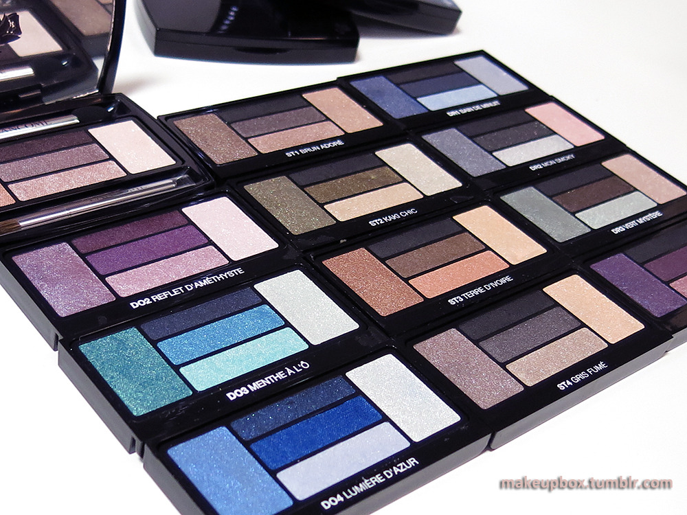
Lancome Hypnôse Eyeshadow Palettes (open images in new tab to enlarge)

No I don't have a whole set of these beautiful 5-color eyeshadow palettes. I wish I did.
The shots were taken at the Lancôme office, and I had a bit of time to do some serious swatching with some of the palettes I really liked. The new range comes in 3 "types".
  1. Doll Eyes: Softer, easier-to-wear colors and textures
  2. Star Eyes: More glamorous, and often more sparkly
  3. Drama Eyes: Intense, high-contrast, with some darker shades
Each palette also comes with a visual tutorial insert with eye looks you can try.

There are 12 different palettes in this range, and aside from the 4 I swatched above, there is also a beautiful deep purple I'd highly recommend, in the Dramatic range (DR4 Violet Magnetique). BUT - I seem to have accidentally deleted the shot of the swatches. :/
I'd recommend just picking colors you like or that suit your lifestyle rather than being restricted by which category they are labeled under. As with any high-end luxury brand, these are high quality shadows you want to be getting a  LOT of use out of, if you decide to invest in them.

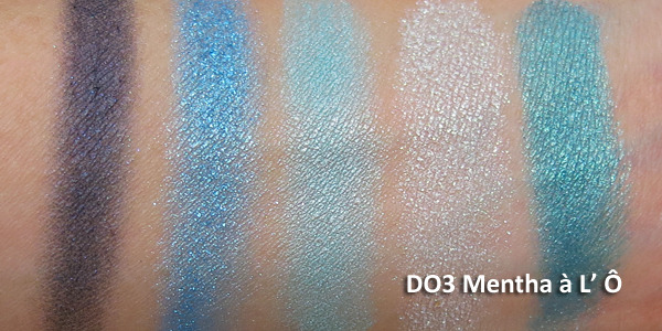
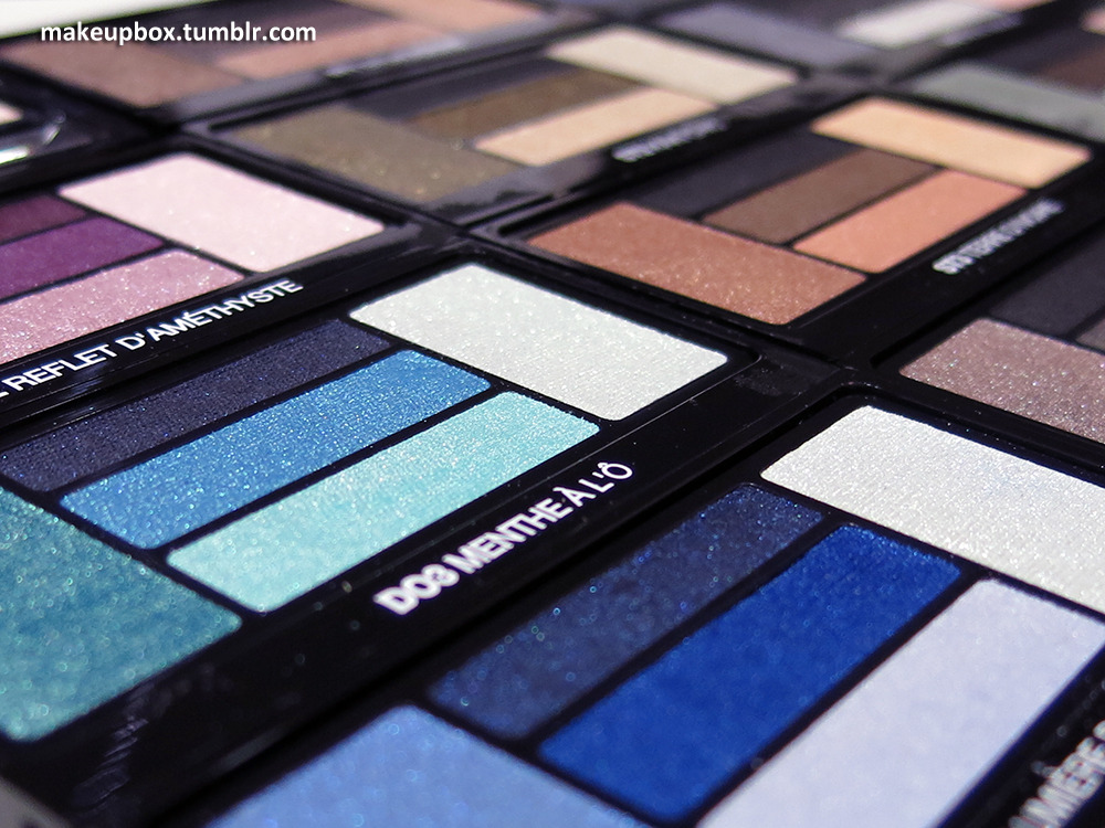
Doll Eyes 3: Mentha a L' O is a beautiful marine/teal collection with shades that remind me of MAC's Tilt and Steamy.

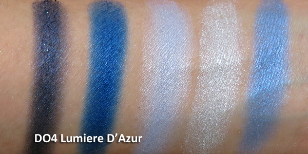
Doll Eyes 4: Lumiere D' Azur is a beautiful collection of blues from navy to cobalt to azure and ice-tones.

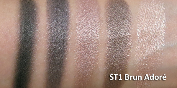
Star Eyes 1: Brun Adore is a perfect neutral smoky-brown set, perfect for Victoria's Secret style bombshell eyes.

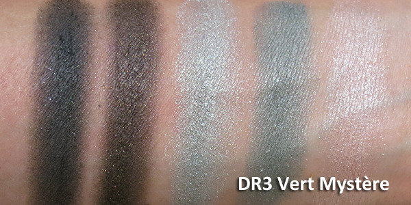
Drama Eyes 3: Vert Mystere is composed of khaki-toned cloudy greens and some neutrals. A very unique palette.


Texture
Up close and personal with Lancôme Hypnôse Eyeshadow Palettes

I'll let the swatch images speak for themselves. I took these right there without professional lighting, and I wasn't wearing any base on my arm, so you can see how intense they are. 
NOT all the palettes were equally pigmented though (e.g. DO2 Reflet D' Améthyst was not nearly as pigmented as most of the other palettes), so depending on whether you like stronger or softer shades, it's best to test them out in person before you decide.


Packaging
The layout of the shades has changed a little from the previous Hypnôse palettes but you still get:
  • 5 coordinated shades, including a dark definer shade (always very important by my book)
  • Magetized wells so you don't need to constantly worry about losing your applicators when you pop your compact open or flip it about
  • A brush applicator (blending) and a dual-ended sponge tip with a wide end (packing on shadow),and a thin end (lining).
The applicator wells are magnetized so the sponge applicator and brush don't fall out every time you tip the palette.

 Do you NEED these?

Let's just get it out there; these are expensive!
Each Hypnôse eye palette is US$51 or SGD90 for 2.7g (0.09 oz) of product. They are right up there with the Diors and Chanels.
If you are just starting to experiment and want tons of color to try lots of looks with, you might be better off spending this amount of money on a number of budget palettes with tons of shades.
If the below conditions apply to you,
  1. it's a luxury gift to pamper someone special (this could include yourself),
  2. you don't change up your makeup a lot and would rather invest in a few quality items rather than in a lot of cheaper things that you won't use,
  3. you're splurging on yourself for a very special occasion like your wedding, 
then you might get a lot of mileage out of one of these, because they ARE very good shadows.