Showing posts with label eyeshadow palette. Show all posts

Thursday, July 7, 2016

Urban Decay Alice Through The Looking Glass palette


Urban Decay's released their Alice Through The Looking Glass palette (SGD$88) in Singapore and here are swatches and a couple of quick eye looks, plus my first impressions on the shades.

The presentation is beautiful if you have a predilection for fantastical, psychedelic dream-scapes. The material is cardboard so this is not a heavy palette. Everything is in theme with the visuals in Alice Through The Looking Glass. 


The palette itself comes with a mirror, a quote from Alice, and a foldout that reveals a big blue butterfly within.


It's no surprise that the colors in the palette echo the tones seen throughout the movie. But aside from 4 brighter shades, the palette is filled with lots of neutrals. This is actually a rather versatile palette. There are plenty of options to create either bright and colorful, or soft and wearable looks.


What I always like doing is to combine neutrals and color. This allows me to create flattering, wearable looks that have just enough of a pop of color to make things fun and eye-catching. If you want, you can go to town with mostly bright colors, or play it safe with neutrals.

Shades used below:
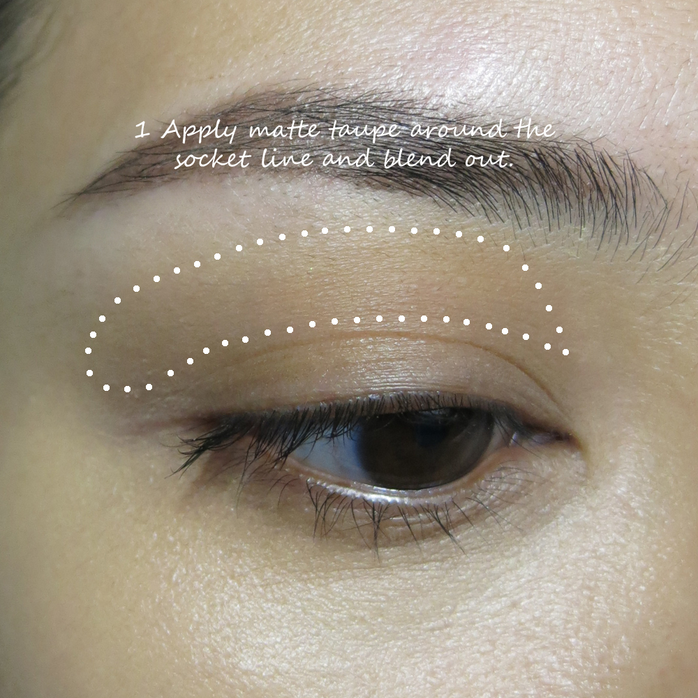
A little navy pencil along upper lash line and outer 1/3 of lower lashes
 Bandersnatch and Metamorphosis around lash line
Dormouse as transition along socket
Duchess on lid
Royal Flush on inner corners

Lashes used: Ardell 120 Demis
I wish I could say all the shades are consistently good, but as with many palettes, there are some stellar shades, some so-so, and one so poor quality that I was actually shocked.


In the first row, the two greens, Hatter and Heads Will Roll, were so-so. Time, the gunmetal with a slight blue sparkle, is incredible. I got that swatch in just a single touch.


Dream On - now how did this shade make it into the palette??!
I had to rub a few times just to get that faint grey sparkly stain you see in the image. It's not really an overcoat type of shadow - the texture is too dry and the color is too deep. I'm just puzzled why this shade made the grade; shouldn't there be a minimum quality requirement for Urban Decay shadows?


That aside, most of the other shades are pretty nice in this row. I love Gone Mad and Duchess, and Reflection is a can't-go-wrong matte beige.


As for the warm-themed third row. These 5 shades make a perfect Fall palette.


I had initially expected Metamorphosis to be a bit bright and garish, but it's actually a nice periwinkle satin blue. Pretty.

Also, Cake looks very bright but if you blend it in with other shades it's just a soft warm rose shade, as in the look below.

Shades used below:
Cake in the socket and blended out towards the temple
Paradox on the lid
Gone Mad in outer corner
 Lily around inner corners
A little black liner smudged along the lash line, and a bit of Time blended over it to smoke out the line 

Lashes used: Ardell 110s

Both looks were done using a mix of brushes and without any eyeshadow primer.

This is a 2/3 neutrals, 1/3 colors palette. I think this is a good option for those who maybe want to experiment a bit with colors once in awhile, but mainly want plenty of neutral everyday shades. The quality is generally good, aside from that strangely unpigmented shade Dream On, everything performs pretty well. The brights are all pretty sheer and blend out quite easily, so it's probably more suited to those who aren't too daring with colors yet. Don't expect an intensely bright effect from the greens, blues and pink unless you really pack on the pigments over a good primer.


Wednesday, February 10, 2016

ZOEVA Rose Golden Eyeshadow Palette Swatches and Review


As a fan of ZOEVA brushes, I admit I haven't been all that curious to try out their makeup. Until the Rose Golden palette that is.

This is a 10-shade palette filled with mostly warm metal tones from copper, peach, rose, soft wine, and 3 very functional matte shades which are nicely chosen to provide a little bit of definition and contrast where you maybe don't want shimmer. Namely the socket line, brow bone, and lash line.


The pigmentation of most of the shades are buttery smooth and very soft, but the surprising thing is you don't get a ton of fall-out. These are not exceedingly powdery, which many affordable shadow lines that also give good payoff (e.g. Wet n Wild) tend to be. These shadows are formulated quite similarly to higher-end shadows - true to color, and neither too unpigmented, nor overly soft and intense. You get medium payoff, good blendability, and the option to build up intensity if you need.


Most manufacturers - cheap or expensive - tend to get the metallics right. But I was especially impressed by the mattes in the Rose Golden palette. I will say that a couple of the darker shades here are less pigmented than the others, but that might be a good thing for beginners who are afraid to load on too much dark color too quickly.


Luster, the medium beige matte shade is great as a brow bone shade and even just to clean up around the edges of your eye look as a final touch before mascara. 
Reflective Elegance is a soft warm peach-pink champagne with incredible pigmentation. 
Copper is King is to me THE shade that draws the eye in this palette. It's a true copper with wine undertones, and looks like it would be extremely red and intense, but actually goes on soft. 
Shining Bright is a mauvey metallic brown that is beautiful all over the lids. 
Rusty Petals is a chocolate-y deep bronze which is not as pigmented as I'd expected. This has more of a tendency than the other metallic shades to go on slightly patchy.


Foil is a coppery brown which sometimes look a little rosy in the pan, but goes on more bronze and warm. 
Just a Rose is a quintessential duochrome rose gold with a rosy undertone and coppery-gold highlights. 
Golden Rule is straight-up gold - I love this color; it has enough neutral beige tones in it to not look overly yellow and harsh on the skin. 
Harmony is a taupe matte shade which is great as a transition color in the socket. It's a bit on the cool side, but that only brings out the warm metallic shades more. Dark haired girls can also use this in their brows. 
Wonder Full is a dark matte cocoa, and as with the metallic dark brown in the palette, this is also slightly patchy and not as easy to control and blend compared to the other shades. It still works fine - it's just not as easy to work with as Luster or Harmony.

The quality is fair to great but definitely not consistent across the different colors, and with some of these shades, you do need to spend some time packing on the color for intensity. If you are expecting a super-vibrant molten metal look with this palette, you might be disappointed. I've seen some very intense and vibrant looks done with this palette online, and I'm going to go out on a limb and say you can't get that effect using just this palette - without a primer or cream shadow to grab and intensify the pigments, or foiling the shades with some water.

Applying it on clean lids with standard dry brushes will give you this sort of intensity below. (I'm wearing brown pencil along the lashes as well. The dark shades will not give you this intensity on their own.)


VERDICT:

This is an affordable, good quality palette I actually recommend for beginners or those who want a nice daily palette with beautiful warm tones. It's also a palette girls with blue or grey eyes can use to maximize contrast with their eyes, although honestly speaking, I'm not a big fan of restricting your eye looks by eye color. (You are more than your eye color - your hair, skin, lip and cheek shades, outfit also affect how shades look on you.)

So this is good for anyone unless you want maximum color intensity and payoff from the get-go. I find these comparable to maybe MAC or Too Faced shadows in general. Smoother and less powdery than Wet n Wild, less pigmented than Urban Decay and Make Up For Ever.

I do feel this is a palette lacks 1-2 pale shades for paler girls to use as highlight colors. If you are MAC NC25 and paler, none of the shades will really be pale enough to act as highlights. Not even the soft yellow-gold shade will be bright or light enough to add a strong pop on paler skins. Just something to be aware of. If you want a single palette with a whole spectrum of light to dark tones and don't want to have to add in paler ivory or champagne shades from elsewhere, this might not be for you.

I purchased my ZOEVA Rose Golden palette from Sephora.sg for SG$32.99.

Sunday, January 3, 2016

MAKE UP FOR EVER Spring 2016 9 Artist Shadow Palette #3


I’m a big fan of the MAKE UP FOR EVER shadows because they have this very intense, creamy feel although I don’t always recommend them for newbies because the pricing of single shadows leans on the high side. So when they came out with the first neutral 9 Artist Shadow Palette for just SGD$69 it was a bit of a dream come true.

For 2016, they are releasing a limited edition Spring palette filled with fresh soda-pop colors. If you love colors in general, and want a mix of soft and strong ones, this is a more wearable alternative than Palette No 2 (limited edition in 2015), which leans towards strong, acidic tones.


This is a fun purchase to add to your collection if you already own some neutrals. There are lots of dusty pastels you can use for soft, sweet looks, and also some options for intense, bright peacock colors.

I especially love the gorgeous coral shade in the center, which has an iridescent gold glow. And the column of purples on the right make a beautiful trio.


This probably isn’t an item I recommend as a “first palette” purchase because you probably need a few neutral/matte shadows (brown, black, grey, etc) to use as transition and definer shades in the socket and along the lash line. That’s optional of course - if you like colors in the socket and along the lash line just go for it.

The most obvious way to wear the shades is to group them in columns top-down, and they look beautiful that way, but don't feel restricted to this. In fact, I would even suggest seeing this as a palette filled with single shadows - not necessarily that you need to create an entire look from within the palette. You also get 9 x 1.5g shades (each a full-size MAC shadow) for SGD$69 - which is incredible value considering you usually can't even get 2 full-size MUFE shadows for the price.

I did 3 different eye looks below using shades in the palette, and it's just a reference for how you can pick/pair colors, and also supplement your look with a matte color in the socket or dark pencil smudged along the lashes as a base to add dimension and definition.

Sunday, August 16, 2015

Weekend Smoky Sparkle: Urban Decay Naked Smoky Look


There's a single glitter-infused shade in the Naked Smoky palette by Urban Decay, and the shade is gorgeous (Armor) but weekend is pretty much the only time I would wear it!

You have to be prepared for some fallout when you wear glitter smoky shades, so if you can, try to do your eye makeup first, and the rest after you clean up or you'll have tiny specks of glitter and black on your cheeks, your nose, etc.


The four shades I picked out today were:

  • Main lid shade: Armor - metallic taupe with platinum glitter
  • Socket and wings at outer corners: Smolder - deep prune
  • Lash line: Black Mail - satin charcoal
  • Inner Corners: High - pale champagne beige

I did also use a little of the 2 palest matte shades (Combust and Thirteen) on my browbone just to clean up and serve as contrast against the metallics on the lids.


Tip:
This is a smoky look, but I didn't smoke the color up too high above the socket. In fact I stopped right at the socket line. I wanted a more elongated catty effect, rather than a full-on rounded smoky eye, so when I was blending I concentrated on sweeping and diffusing the colors outwards from the outer corners instead of upwards.

I did try using the dual-ended blender/smudger brush included with the palette. I love the smudger tip for applying shadows along the upper and lower lash lines.  It's very precise but shaped just right for getting a soft smoky liner look.

The blender tip though, I'm not a huge fan of. Partly because UD's bristles are packed too stiff and not fluffy enough to really diffuse shadows. You CAN still use this to pack and buff on color but you will get tons of fall-out using this shape for that purpose. It's better used clean to blend out edges or to buff two colors together. Which means you might need a separate packer brush to apply shadows onto the lids, before going in with this to blend.


Other products used in this look:

  • Urban Decay 24/7 Pencil in Perversion - applied along the waterline and lash line, but smudged out a little so there is no hard defined line.
  • Eyeko Black Magic mascara
  • Afterglow Blush in Score - peachy-pink blush
  • Urban Decay Sheer Revolution Lipstick in Sheer Liar - rosy beige-brown my-lips-but-better color with a creamy semi-sheer texture


Friday, June 12, 2015

By Terry Eye Designer Palette 1 - Smoky Nude Review, Swatches, Demo


If you ask me what are some of the best luxe neutral palettes to invest in this season, one of them would definitely be By Terry's Eye Designer Palette No 1 in Smoky Nude.

I mean - just look at it!

It's expensive; let's get that out of the way. In Singapore this is $145. But let's not forget that you get 10 full-size shadows (1.4g each); more than 9 MAC shadows. And these colors are idiot-proof. I can find very little that is wrong with this palette other than the fact that I don't like the applicator inside, and I don't particularly love the rubbery purple case, which in my opinion actually doesn't look as posh and luxe as the brand is. 

That's a minor problem, but when you're paying this much, I think you deserve to get the best and most beautiful packaging.


Still, the product more than redeems itself. 
I don't really need to say much besides showing you the swatches. 


  1. It is very pigmented. You hardly need to rub to get fantastic payoff.
  2. Some chalky shadows can come up pigmented on your fingers, but do not adhere or transfer well onto the lids. That's not the case with this. The color transfers and builds beautifully onto the lids.
  3. The colors are mostly matte or satin, but all the textures are consistently smooth to the point of feeling almost buttery. They are incredibly easy to blend, so even if you don't have mad makeup skills, you would probably still be able to get a great look with this.
  4. There is a great mix of dark and light shades, spread between warm, cool, and rosy neutral tones.

By Terry Eye Designer Palette 1 - Smoky Nude; top row

By Terry Eye Designer Palette 1 - Smoky Nude; bottom row
And now I'm going to show you a demo, using 4 of the shades for a quick look. Not a dark look, but with enough definition and drama still.

Saturday, June 6, 2015

Bobbi Brown Shimmering Sands Palette Swatches, Review, and Demos (Day/Smoky Looks)


Bobbi Brown's launched their Summer collection, which includes the limited edition Shimmering Sands palette which a lot of people were very interested in when I posted images of it on Instagram. This palette is actually smaller than it might seem in pictures. My palette is a press sample, so the weight of each pan isn't printed on the bottom, but they are much smaller than a typical circular shadow so my guess is they're about 0.7g each or so, as compared to the typical 1.5g.

The good news is this is a very portable palette if you want something quite subtle and good quality, but not overloaded with too many full-size shades that you can't finish.


As you can see from the swatches above and below, there are a mix of textures, from sparkly to metallic, to satin, and matte. That said, there is only 1 truly matte shade and 2 satins that look mostly matte but contain tiny sparkles in them. A usual for Bobbi Brown shadows, I personally find the shimmers/metallics to be the smoothest and easiest to work with. The matte and satins are smooth but extremely subtle.

All the shades are pretty smooth, and pigmentation level is sheer to medium intensity. If you like Urban Decay and Make Up For Ever type intensity, you might find these quite subtle. But if you're more accustomed to MAC and Bobbi Brown shadows, then most of these are pretty good.

Both of the dark browns on the bottom right of the palette are actually those sparkly translucent creamy shadows that work better patted on over other shades. They also work alright on their own as a wash over the entire lid, but they won't work well as definer shades without eyeliner or a dark cream base, as they are too translucent and not nearly dark enough to shade and define.


Compared to the Spring Hot Nudes palette from earlier this year, I actually prefer Hot Nudes. I feel I get a bit more variety; cool, warm, matte, shimmer. While the shades in the Shimmering Sands palette are beautiful, there isn't a huge variety. You will find a single transition shade, and none of the colors are really deep enough or matte enough to make great liner/definer shades along the lash line.

But it's still versatile enough as a daily palette, and can give you some options for transitioning between day and night.


Below are 2 quick tutorials to demonstrate the possibilities to you. Do take note that the Smoky Look was done with a brown liner smudged lightly onto lids as a base. The metallic brown in the palette is nice but not as intense as this without a base.

DAY LOOK


 SMOKY LOOK