Showing posts with label makeup review. Show all posts

Friday, July 17, 2020

iHope KANEBO 2020 Luxury Makeup Revamp (plus Swatches)


KANEBO Eye Color Duos 2020

Japanese luxury line Kanebo has revamped their entire makeup line this year, and did a complete 180 from conservative “OL” (office lady) aesthetic to something completely fresh and vibrant.
Besides including funky mixers and pop shades in their buttery N-rouge lipstick line to let you tweak and create completely unique shades yourself, they’ve also added interesting multipurpose creams called Drawing Dual Rouges and Drawing Dual Pens that promise to be usable on eyes, cheeks, lips, anywhere you like. Even the eye palette is a small custom compact into which you can slot up to 3 mini duos. We are basically free to experiment with colors and textures and it's all done with maximum portability, minimum weight and fuss.
Considering lipsticks cost about S$60 a pop and the tiny eyeshadow duos are S$35 in Singapore, it’s not easy to explore the line if you’re shopping online during the current pandemic, so here are all the color products (aside from the 3 basic monotone Drawing Pencils) swatched for your reference!

Tuesday, July 17, 2018

It Cosmetics CC+ Oil-free Matte SPF40 Review


One of the products that I was most excited about at the recent Sephora Press Day in Singapore was the Oil-free Matte version of It Cosmetics' bestselling CC+. Living in sunny Singapore, who wouldn't want a matte, oil-free, pore minimizing version of the full-coverage high-SPF skincare cream? 


Even as someone with combination-dry skin, I was excited to try a more sweat-resistant and less creamy version of my favorite BB/CC-type product the past 1-2 years. 

Ingredients Run-down

It Cosmetics CC+ Oil-Free Matte ingredients
First off, the ingredients list is impressive as usual. They have all the signature skin-pampering and calming extracts, with the addition of tea tree extract, sulfur, willow bark extract (salicylic acid), charcoal powder and niacinamide, traditionally great for troubled, oily, spot-prone skin. I've not had any significant breakouts ever since I cut down on my sugar intake a couple of months back but I do work out about 5-6 days a week and I can get clogs and black heads, so I would never turn down pore-clearing ingredients.

There aren't really many ingredients in here that would be overly-drying for drier skins despite the inclusion of sulfur, willow bark extract, and charcoal powder. There are just too many conditioning agents. Even though I have dry areas, this did not dry me out and felt comfortable through the day. 

Shade Range

Sunday, April 3, 2016

Natasha Denona 28 Palette Swatches and Overview


Natasha Denona is one of the new "It" brand among makeup afficionados, and one of their hero products is the 28 pan shadow palettes, which come in just 2 variations - Green-Brown, and Purple-Blue.

These are pricey - let's get that out of the way - each palette is US$239 - which may be a little too much to splash out at one shot if you're not sure about the quality and the type of shades that you're getting. But if you're building up your collection or you just love colors and variety in general, the fact is you're paying a little over $8 per shade, and with 2.5g of product per pan (a typical MAC pan has 1.5g) it's actually really good value for money if you will use a majority of the shades.

Otherwise, the purpose for my post is also for you to take note of individual colors that perform well and that you might especially like, because Natasha Denona shadows are available in singles, as well as 5-pan and 10-pan palettes, although you won't get each color at the same price of course.

Each palette is not plastic, but made of a sturdy padded magnetized "foam" that does absorb a bit of shock and reduces the chances of your shadows shattering during transportation. The bad thing about this is they are also quite a lot heavier than typical plastic palettes, if you're having to carry a lot of things around in your kit.


Quality and Pigmentation

For the most part, the shades are great quality. Highly-pigmented and smooth. But this also means fallout, which is normal for most brands.

I can't say all the shades are equally good though. Natasha Denona shadows are talc-based, so similar to other brands with talc-based formulas (think Morphe, etc) the metallics and pearls are outstanding; and the mattes tend to be a bit more inconsistent.

In the Green-Brown palettes, I would say the bulk of the shades are fair to great. There is maybe one matte shade (64V Shell) which is patchy and poorer in quality than the rest. But for the most part, you can use any one of the shades and be pretty confident it will perform well. As for the Purple-Blue palette, it's a lot less consistent. Several of the mattes (70P Cool Plum, 28V Electric Violet, 82V Nina's Orchid, and 24V Aubergine) are quite patchy and not as easy to work with if you want to build up intense color on the lids with these.


Colors

I have to say in terms of the color composition and choices, Purple-Blue is hands-down the winner for me. There are a lot more unique and wonderfully beautiful shades, including some incredible duochromes, and if you are going to be paying $239 for one premium palette, I wouldn't suggest going for the more "normal" Green-Brown since it's probably easier to find some comparable shades in other palettes and lines.

Then again if you want reliable quality and plenty of daily wearable options in one palette and don't already own lots of neutrals and warm tones, then Green-Brown would make sense for you, since there are a few more patchy, unpigmented "duds" in Purple-Blue, sadly. Still, I don't regret getting it because there are a lot more of the pretty shades.

And even with the Purple-Blue palette, there are a good number of neutral shades for you to "complete your look", if you don't want just purple and blue all over. Neither palette has a black, which I am fine with, because that's one of those utilitarian shades that I'd rather buy and restock separately in most cases.

For the looks below, I used several shades to try and test as many different shades and finishes as possible.

Green-Brown Look:

  • 64V Shell as transition shade in socket
  • 90V Sand storm in outer half of socket for warmth and dimension
  • 78M Umber in outer corners for depth
  • 14M Antique Olive in center of lid and along lower lash line
  • Mix of 86P Golden Aquamarine and 16M Emerald Green in inner corners for a cool-green contrast
  • 20M True Gold down the center of the lids for a pop of sparkle and shine on top of the Antique Olive shade
  • I also used a charcoal grey pencil as liner, and 15M Bottle Green just on top of the liner in outer corners of my eyes for some depth

Eye look done using the Green-Brown 28 Palette


    Purple-Blue Look:
    • I applied navy blue pencil along the upper and lower lashes first, then applied shadows over top for a subtler, more pearlescent liner effect.
    • 80M Piggy over inner half of lids
    • 11V Steel Blue blended softly into socket line for subtle shading
    • 05M Calypso Blue over outer half of lids (this gorgeous duochrome shade also "transforms" the look of the pencil and the matte socket shading beneath)
    • 11M Metallic Steel Blue over the pencil to bring out more blue in the liner
    • 04M Chromatic for a metallic platinum sparkle down the center of the lids
    • 52M Golden Beige over entire brow bone area for a golden-peach contrast to the cool-toned look

    Eye look done using the Purple-Blue 28 palette


    Conclusion?

    These are definitely worth checking out if you're a makeup fanatic.This is a great new line to try, and while the formulas aren't earth-shattering in any sense, it IS pretty good value.

    If you're just starting out however, I might suggest going with cheaper lines just to stretch your dollars a bit before you commit to something as pricey as these. And you know yourself - if you're likely to use the same 4-5 colors daily and don't often veer out of your comfort zone, then it's really not worth buying a large palette anyway.

    I will probably get more daily use out of the Green-Brown palette as a whole but there are some shades that are so great in the Purple-Blue palette that I would say it's still worth checking out if you're more of a cool-toned gal.

    I do definitely recommend checking out some individual shades like 05M Calypso Blue, 01V Navy, 60M Golden Rose, and a whole range of the other metallics in this palette, if you don't want to get all 28 including the patchier shades. But just do your calculation, cos if you're getting a fair number of single shades, it might add up to the same amount as (or more than) the 28 palette, in which case you might as well just get the whole palette, duds and all.

    Friday, January 23, 2015

    Clé de Peau Beauté La Beauté Enchanteress Spring/Summer 2015 Makeup Collection

    Selections from the Cle de Peau Beaute Spring Summer 2015 "La Beauté Enchanteress" collection

    Just a very quic post showing you swatches of some items from the gorgeous Cle de Peau Beaute Spring/Summer 2015 makeup collection. 

    The colors are cool, iridescent, soft - and there are 2 new eye palettes (SGD80 for the 6g refills); 309, and 310. And the collection also includes 3 new lip colors (SGD70 for refills); 112, 211, 313. The ones I received for review are swatched here.

    The eye palette I really love. Even though I must say I'm not much of  a blue eyeshadow person. Just the way they've paired an icy gossamer blue with a deep smoky navy and then added 2 beautiful neutral shades makes everything infinitely more classy and wearable. Nothing garish or loud about these colors. In fact you can do a rather neutral look by wearing the neutrals on your lids, the pale blue just in your inner tear-duct area, and then the navy as a liner.

    Or you can flip it around and use the blues on the lids if you prefer a less subtle look, and just use the neutrals in the socket and on the brow bones. Either way, the texture is typical of classic Japanese-luxury makeup; very silky, translucent and blendable.

    Cle de Peau Beaute Eye Color Quad 310: Dusky navy, pale blue, and neutrals

    Cle de Peau Beaute Extra Rich Lipsticks 112, and 313
    The lipsticks are all part of the same line (Extra Rich), but the textures of the 2 I tried are pretty different when worn.

    Swatches: Cle de Peau Extra Rich Lipsticks in 313 and 112
    313 is a lovely rich coral in a satin texture, with a medium sheen and moderate opacity. You do need to either prep your lips properly with a liner or primer, or be careful to really build up the color a bit, or it can look slightly patchy up-close.


    Cle de Peau Beaute Extra Rich Lipstick 313

    112 on the other hand, is a beautiful deep mauve pink with a semi-sheer glossy texture, although it can be built up almost to opacity, like in the image below. It looks dark in the tube but goes on much softer and more wearable.

    Cle de Peau Beaute Extra Rich Lipstick 112

    I can't tell you which items to focus on. I actually like everyone of these that I've tried.

    What I will say though - if you must pick one - is that lipsticks do tend to be quite overpriced in Sg and for most people $70 is a astonishing amount to pay for a lipstick refill, so the quad is a worthier investment since you don't need to bring it out for touchups and $80 for 6g makes it cheaper than MAC. Then again - if you love the lipsticks, I would invest in the mauve. It's more even in texture and a far harder color to dupe with cheaper brands. 

    Thursday, May 1, 2014

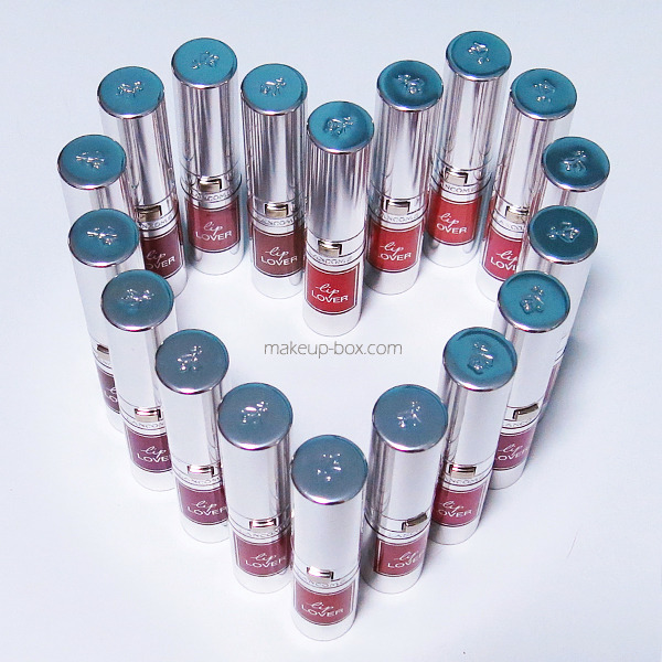
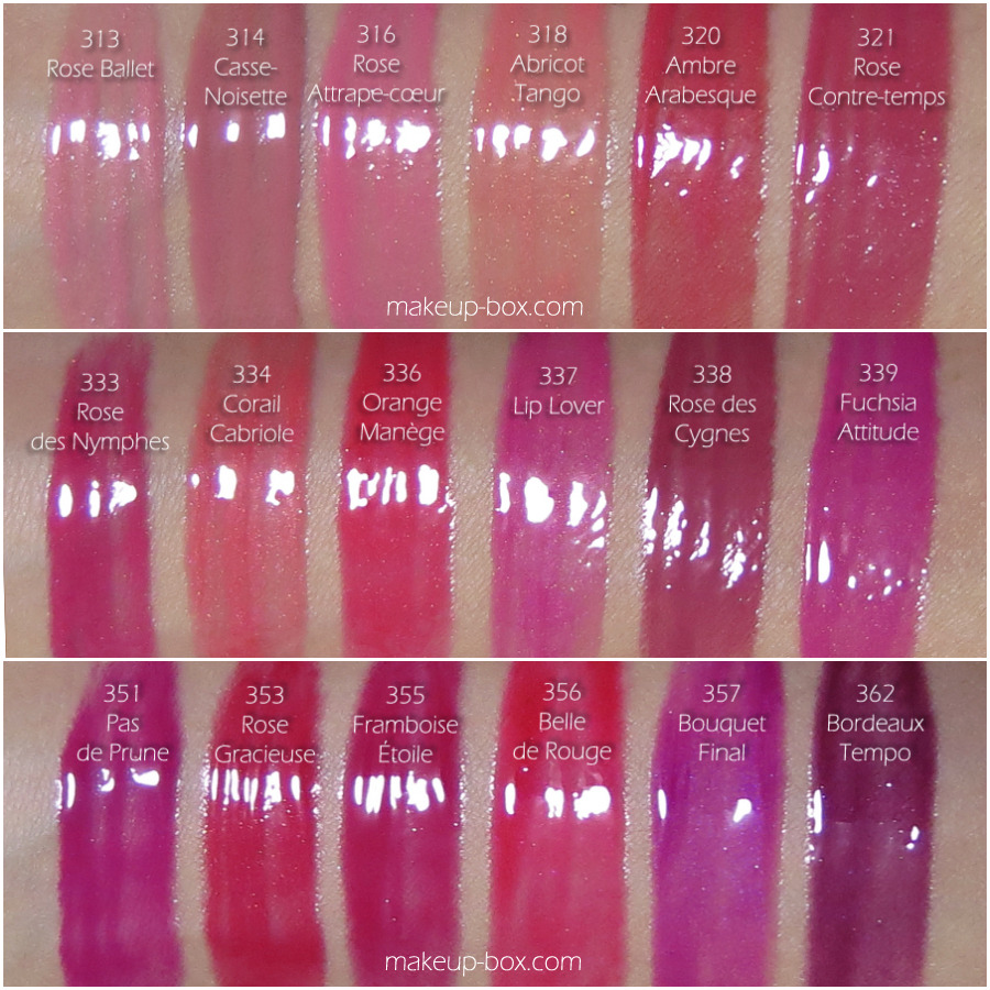
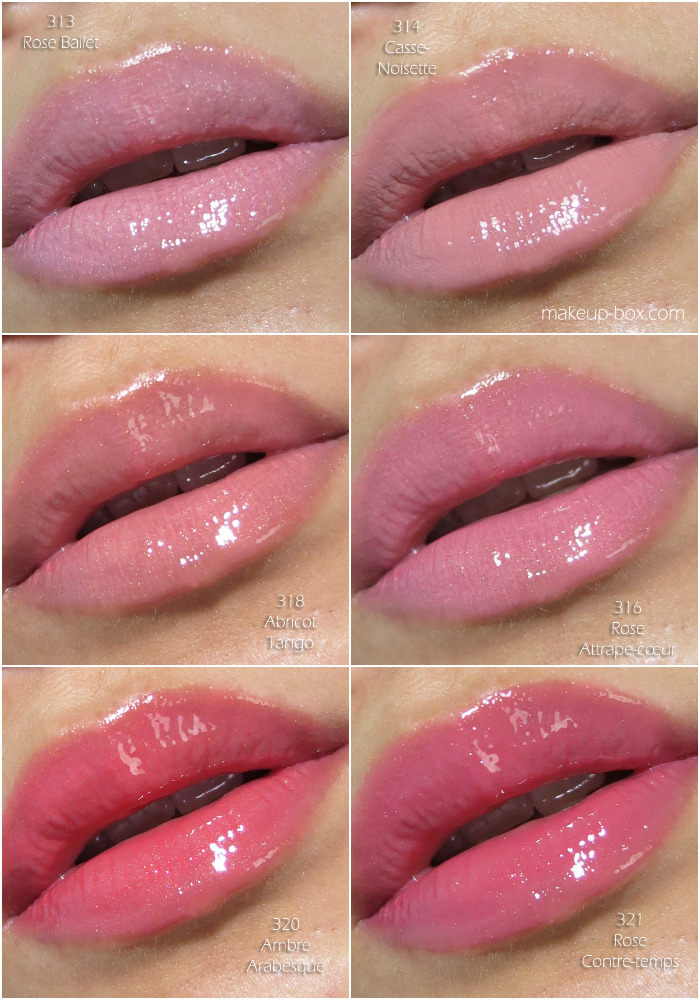
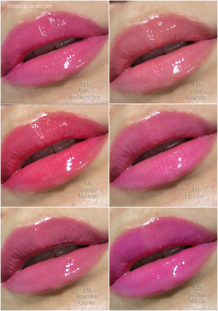
    Lancôme Lip Lover Swatches!

    Lancôme Lip Lover
    For a more detailed review, click here!
    Otherwise just scroll down to look at all the swatches!
    Lip Lover Swatches: Click to expand

    Soft/Nude shades.

    Coral and pink shades!

    Deeper, brighter shades.

    Thursday, February 27, 2014

    Too Faced Chocolate Bar Eyeshadow Palette and Sweetheart Blushes in Peach Beach and Something About Berry!

    Too Faced Chocolate Bar Eyeshadow palette and Sweetheart blush in Peach Beach

    Swatches swatches swatches!
    Received a gift card from a very lovely lady and picked out a few gorgeous things at Sephora the other day.
    Too Faced has just brought out its new makeup products, and these 3 are what I consider the Must Check Outs.

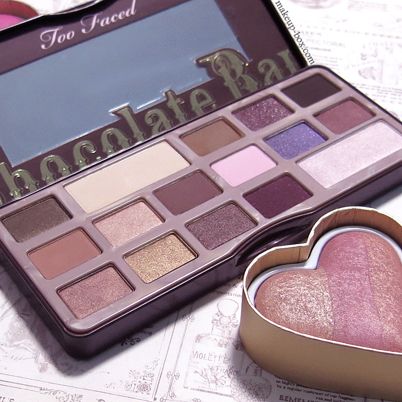
    Chocolate Bar palette (SGD$69)
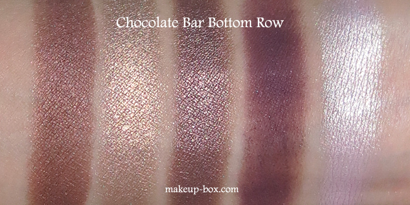
    This neutral palette is formulated with real cocoa powder, so it does actually live up to its name in more than just appearance. The colors are pretty intense but a beautiful blend of soft pink/lavender tones, and warmer browns.

    I have to say the mattes are slightly chalky, so they work better as definer shades along the lashes or in the socket, rather than as a main color over the majority of the lid. The metallics, in true Too Faced fashion, are absolutely jaw-droppingly beautiful.

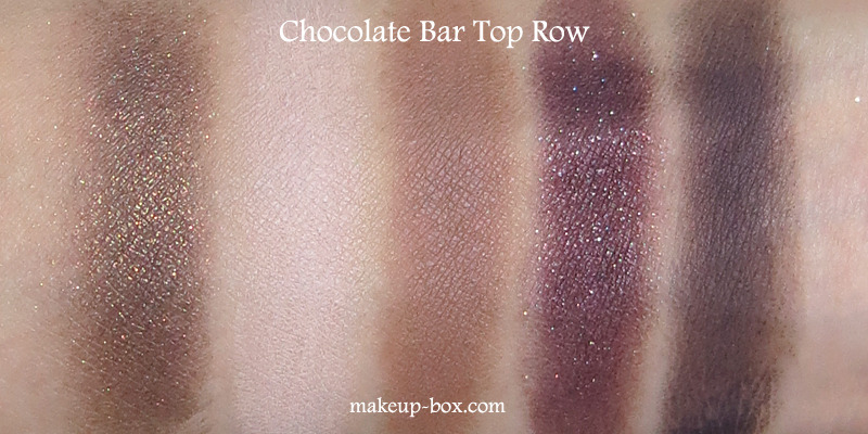
    Too Faced Chocolate Bar Eyeshadow palette Row 1

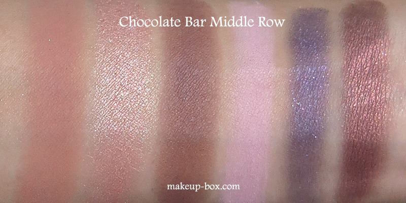
    Too Faced Chocolate Bar Eyeshadow palette Row 2

    Too Faced Chocolate Bar Eyeshadow palette Row 3

    If you find the NARSissist palette too smoky and dark, and the Naked 3 a little too metallic and pink/pale, this is somewhere right between those 2, with an extra pop of lavender for some fun.


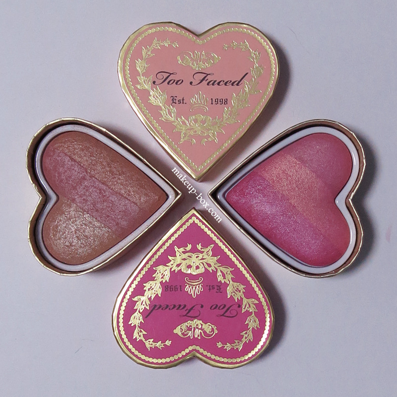
    Sweetheart Blushes in Peach Beach and Something About Berry (SGD$39)

    I loved the first Sweetheart Blush trio Too Faced brought out last year and still regret I didn’t get one. It was a gorgeous blend of sweet blossomy-pinks.

    Too Faced Sweetheart Blushes (2014) 

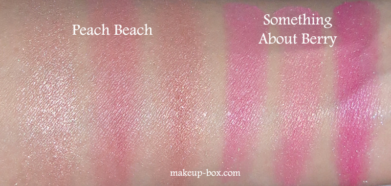
    This year though, there are 2 new shades fill the gap! And besides getting 5.5g of product, you can use each of the 3 strips on their own for a slightly different color, or swirl them all for a 4th shade.

    Peach Beach is a bronzy-pinky-peach which is a GORGEOUS alternative to NARS Orgasm (not as sparkly or red) and Deep Throat (more intense than Deep Throat). It’s lovely as a shimmery peach blush on pale to medium skins, and also works as a warm highlighter on tan to dark skins.

    Too Faced Sweetheart Blushes (2014) swatches
    Something About Berry is a hot raspberry pink shimmer. Lovely on tan to darker skins because it’s translucent but has enough rich intensity to give a beautiful flush. On medium to light skins it can be a bit too much, so use a light hand. It’s a look though, if you like dramatic pink cheeks.

    Monday, February 24, 2014

    RMK Kaleidoscope Nuance Color 02 Translucent Coral Pink

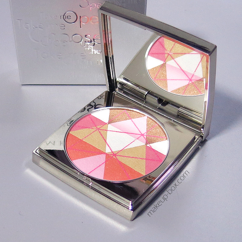
    RMK Kaleidoscope Nuance Color 02 Translucent Coral Pink
    A multitasking “smart” beauty powder?
    I’m there.

    This powder is quite silky and creamy-feeling; like a pressed powder foundation or high-end blush more than the typical pressed or illuminating powders. Pigmentation is also similar to a pressed foundation and you get pretty good pay-off.

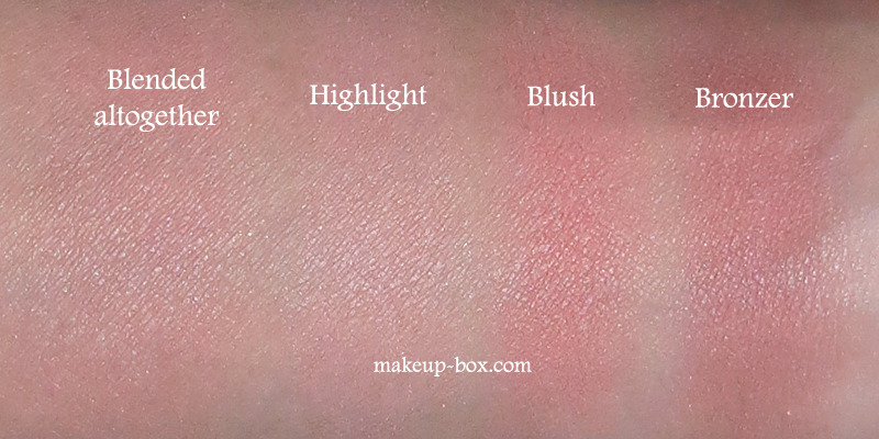
    • Swirl the bottom half together for a coral blush
    • Sweep across the top curve of the pan for a bronzer
    • Sweep along the central triangles for highlighting
    • Swirl all around for a luminous warm face powder

    The cons? 
    Price: RMK is not cheap in Singapore, and this pretty powder costs $79 a pop for 7g. Definitely higher end.
    Skintones: The range of skintones where all 4 usage shades will show up nicely is limited to the medium-ish.

    For everyone else, usage is more limited.
    If you’re very fair, the highlight isn’t light enough and it might also be a little too dark swirled all around as a face powder. As a soft bronzer and a blush though, this would be perfect as it’s not too muddy or dark, and the peachy undertones are flattering.
    If you’re tanner, obviously the contouring color won’t show up well, but you can use it as a beautiful highlighter and illuminating all-over powder because the texture is not chalky and there are enough warm pigments to brighten the skin.

    Kaleidoscope powders are limited edition for Spring 2014, so if you’re keen check out your local RMK counter to try it on yourself! The other illuminating powder is a lighter one with pastel blue, pink, white and beige triangles. It’s a better match as a face powder for my skintone (mac n2-3 ish) but that one can’t be used as a multitasking powder, so perhaps note worth the price-tag compared to this one.

     Kaleidoscope Nuance Color 02 Translucent Coral Pink swatches

    Thursday, July 11, 2013

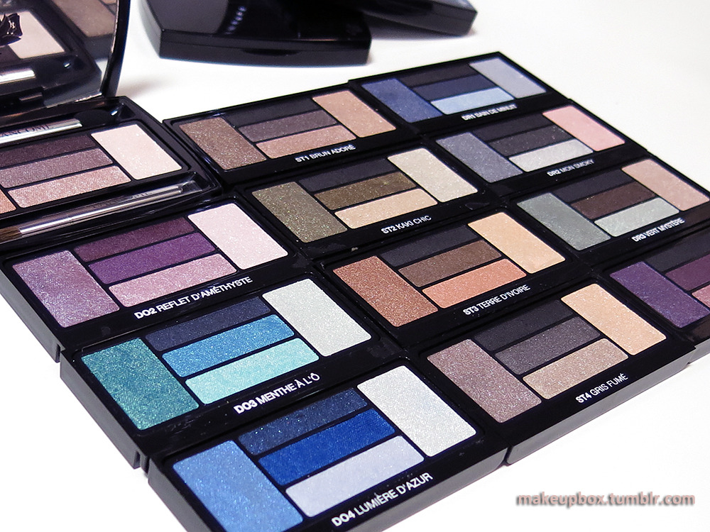
    Serious Eye Candy: Lancome Hypnôse Palettes Overview and Swatches

    Lancome Hypnôse Eyeshadow Palettes (open images in new tab to enlarge)

    No I don't have a whole set of these beautiful 5-color eyeshadow palettes. I wish I did.
    The shots were taken at the Lancôme office, and I had a bit of time to do some serious swatching with some of the palettes I really liked. The new range comes in 3 "types".
    1. Doll Eyes: Softer, easier-to-wear colors and textures
    2. Star Eyes: More glamorous, and often more sparkly
    3. Drama Eyes: Intense, high-contrast, with some darker shades
    Each palette also comes with a visual tutorial insert with eye looks you can try.

    There are 12 different palettes in this range, and aside from the 4 I swatched above, there is also a beautiful deep purple I'd highly recommend, in the Dramatic range (DR4 Violet Magnetique). BUT - I seem to have accidentally deleted the shot of the swatches. :/
    I'd recommend just picking colors you like or that suit your lifestyle rather than being restricted by which category they are labeled under. As with any high-end luxury brand, these are high quality shadows you want to be getting a  LOT of use out of, if you decide to invest in them.

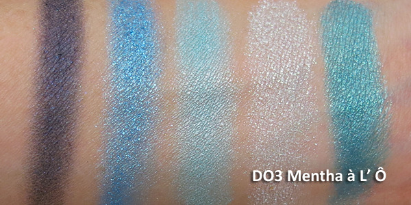
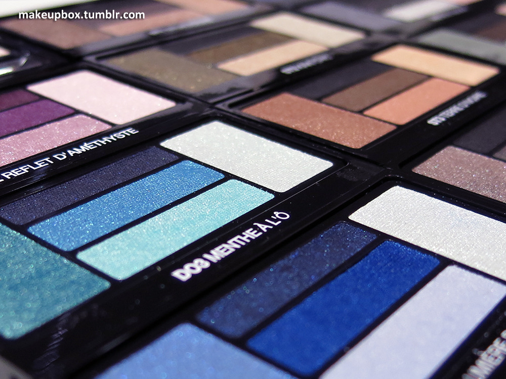
    Doll Eyes 3: Mentha a L' O is a beautiful marine/teal collection with shades that remind me of MAC's Tilt and Steamy.

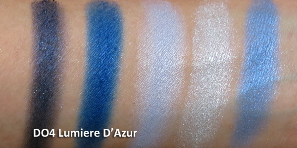
    Doll Eyes 4: Lumiere D' Azur is a beautiful collection of blues from navy to cobalt to azure and ice-tones.

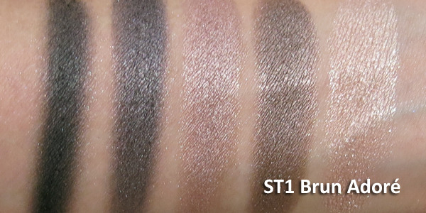
    Star Eyes 1: Brun Adore is a perfect neutral smoky-brown set, perfect for Victoria's Secret style bombshell eyes.

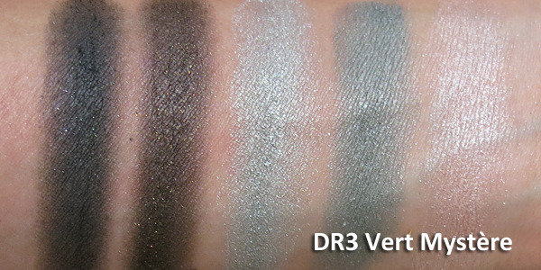
    Drama Eyes 3: Vert Mystere is composed of khaki-toned cloudy greens and some neutrals. A very unique palette.


    Texture
    Up close and personal with Lancôme Hypnôse Eyeshadow Palettes

    I'll let the swatch images speak for themselves. I took these right there without professional lighting, and I wasn't wearing any base on my arm, so you can see how intense they are. 
    NOT all the palettes were equally pigmented though (e.g. DO2 Reflet D' Améthyst was not nearly as pigmented as most of the other palettes), so depending on whether you like stronger or softer shades, it's best to test them out in person before you decide.


    Packaging
    The layout of the shades has changed a little from the previous Hypnôse palettes but you still get:
    • 5 coordinated shades, including a dark definer shade (always very important by my book)
    • Magetized wells so you don't need to constantly worry about losing your applicators when you pop your compact open or flip it about
    • A brush applicator (blending) and a dual-ended sponge tip with a wide end (packing on shadow),and a thin end (lining).
    The applicator wells are magnetized so the sponge applicator and brush don't fall out every time you tip the palette.

     Do you NEED these?

    Let's just get it out there; these are expensive!
    Each Hypnôse eye palette is US$51 or SGD90 for 2.7g (0.09 oz) of product. They are right up there with the Diors and Chanels.
    If you are just starting to experiment and want tons of color to try lots of looks with, you might be better off spending this amount of money on a number of budget palettes with tons of shades.
    If the below conditions apply to you,
    1. it's a luxury gift to pamper someone special (this could include yourself),
    2. you don't change up your makeup a lot and would rather invest in a few quality items rather than in a lot of cheaper things that you won't use,
    3. you're splurging on yourself for a very special occasion like your wedding, 
    then you might get a lot of mileage out of one of these, because they ARE very good shadows.

    Thursday, March 7, 2013

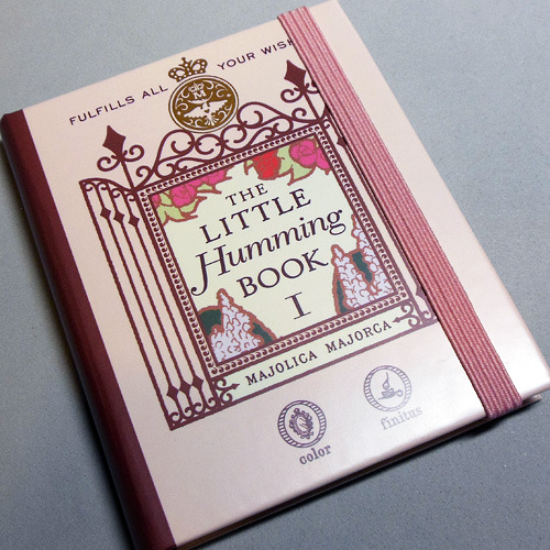
    Majolica Majorca Humming Book I (Swatches, Review, 2 Easy Looks and how to dupe the product!)


    I think Majolica Majorca has fabulously silky and pigmented eyeshadows. But I'm not a fan of palettes where there are a mixture of cream and powder products. Creams have different shelf lives from powders and the lip cream is most likely going to go bad before the other stuff. Also, when powder gets into cream and vice versa, everything gets ruined. 

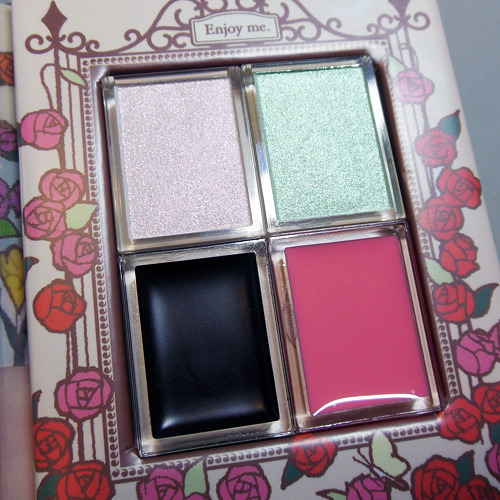
    BUT, when I saw this charming little "song book" in their latest limited edition collection and tested the 3 shadows (1 cream base and 2 shadows) alone and over one another, I concluded it was so brilliant I had to pick one up.

     
    Concept:
    The collection is centered around a dreamy, lyrical flower garden, and the combination of shades gives you exactly that sort of look. Now you CAN possibly use each of the colors alone, but I personally wouldn't do that. 
    Alone, the 2 pale shadows can look a little washed out and not flattering if you don't have a very defined and deep socket. The cream base on its own, does not set and will shift, smear, and crease. The genius is in the combination when the pale duochrome shadows hit that dark blackened plum. You get the most beautiful soft-focus pearl finish.
    The petal-pink lip gloss I couldn't care less about. It looks nice in the pan but applies streaky, lacks pigmentation, isn't flattering on its own, and all in all, you're better off getting Revlon Lip Butter in Strawberry Shortcake.

    Tuesday, August 28, 2012

    Coastal Scents Blue-Red Chrome Mica: MAC Cornflower Pigment Dupe?

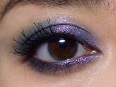
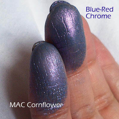
    As you can see from the swatches, not really. BUT if you've ever wished that MAC's Cornflower was a little stronger, finer-grained, and looked as duochrome on the lid as it does in the bottle, then this actually performs better for a whole lot less.

    The only thing you need to watch out for is to wear a good base or primer on your lids, because pure micas don't stick very well and can fade or dust off quickly. This shade is no different.

    Here's a close-up of the 2 swatches over a clear base. (Both pigments don't stick all that well.) As you can see, MAC Cornflower goes on blue with just the faintest trace of violet overtone, but once it's swatched next to Blue-Red Chrome, it looks flat-out periwinkle blue. Blue-Red Chrome on the other hand, shifts very beautifully between blue and a mauve-violet. If you apply it without a base, it goes on very sheer with a violet sheen. 

    For about $1 a sample baggie, this is again something I would recommend you check out OVER a MAC pigment. 


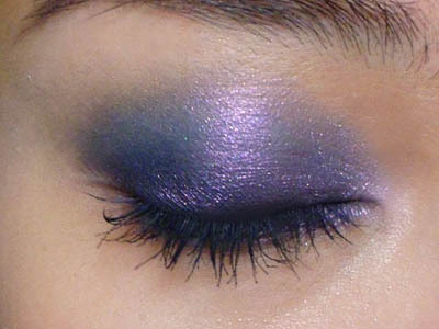
    Step 1: I applied a dark blue pencil (MAC Blooz Kohl) along the lash line and diagonally up across the upper lid almost like a wing, but not extending much past the outer corners. This will serve as a dark base, which is ALWAYS a great way to bring out duochrome colors.


    Step 2: Use your fingers to just lightly smudge and smoke the outer edges.


    Step 3: Using a flat shadow brush so I can minimize fallout, I packed the pigment over the entire lid, from inner to outer corners, up to the socket line. Then I ran the brush along the lower lash line as well.


    Step 4: Just curl lashes and apply mascara to finish!