Showing posts with label plum eyeshadow. Show all posts

Monday, April 6, 2015

Hourglass Modernist Eyeshadow Palette Haul and Swatches: Atmosphere,Obscura, and Exposure


When I saw the Hourglass Modernist Eyeshadow Palettes on Net-a-porter.com, I knew I had to try them. These 5 color eyeshadow palettes look like solidified silt on a riverbed. (Or ribbons of thick fudge in multi-flavored ice-cream.)

These shadows come in a range of gorgeous neutral tones, and the formula is INCREDIBLY pigmented. Almost to the point where they are a bit tricky to use without making a mess. They don't feel like traditional pressed pigments, and they aren't baked. You barely need to touch them to get lots of pigmentation.


But the problem is also that they can go on patchy or give you tons of fall-out simply because so much of it comes up once touched. If you are using brushes to apply these, be careful to use a very light touch or you will use up the palette in no time. And these don't come cheap at USD$58 (around SGD$66) per compact.

I picked 3 of the 5 available palettes:

  • Atmosphere - matte Neapolitan ice cream colors of vanilla, strawberry, chocolate, dark chocolate and one satin-textured chocolate fudge color
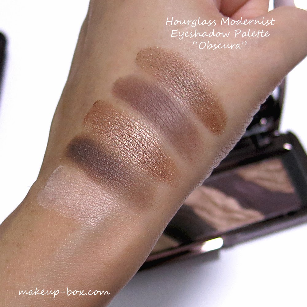
  • Obscura - warm rich brown tones with 1 satin creme brulee shade, 2 metallic bronzes and 2 satin/matte dark cocoa shades
  • Exposure - rosy-plum and wine browns in shimmer and satin textures

I've got the 3 palettes swatched for you here.


As you can see, the colors are beautiful. So are the textures. But you DO need to know how to work with them or you can make a mess. The best thing you can do is to treat these like loose pigments. The shimmery shades can be applied damp (although I suggest picking up the colors on your brush before misting the brush - not applying moisture to the palette directly), and can give you a molten look. But whether you decide to use them dry or wet, I would highly suggest putting on a primer or base first so the pigments have something to grab and cling on to. Otherwise, they can dust and blend right off your skin.

And try to pack on the colors using a firmer, flatter brush just so you don't whip up pigments all over the place. It is quite a waste when you dip a fluffy brush in and see the colors fly everywhere.

Do I recommend these?

If you're a real collector, an Hourglass fan, or you love the look of these palettes, and you don't mind the price or working with loose pigments, then go for it. 

If not, these are very expensive for what they are, and I will say the formula isn't as "sophisticated" as I expected them to be. They are pigmented if you touch them, but they are finicky and trickier to apply than other high-end shadows. Basically they aren't as easy for makeup newbies to use as - say - a Marc Jacobs, Chanel or Dior palette would be. I personally feel if you're paying so much, you should expect products to be MORE foolproof than usual.

I don't regret getting these but I won't repurchase. And if you're on a budget, I wouldn't suggest you get these, even though they're real pretty to look at in the pan. You can get far more bang for your buck with any of the Urban Decay palettes.

Tuesday, December 3, 2013

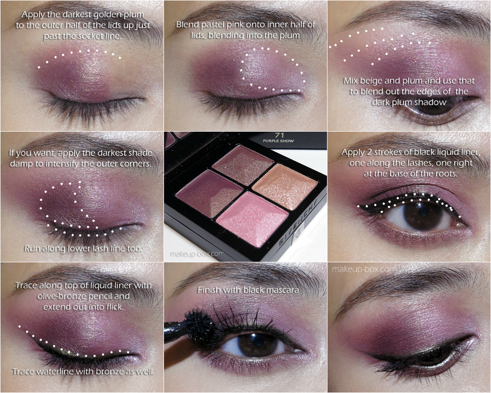
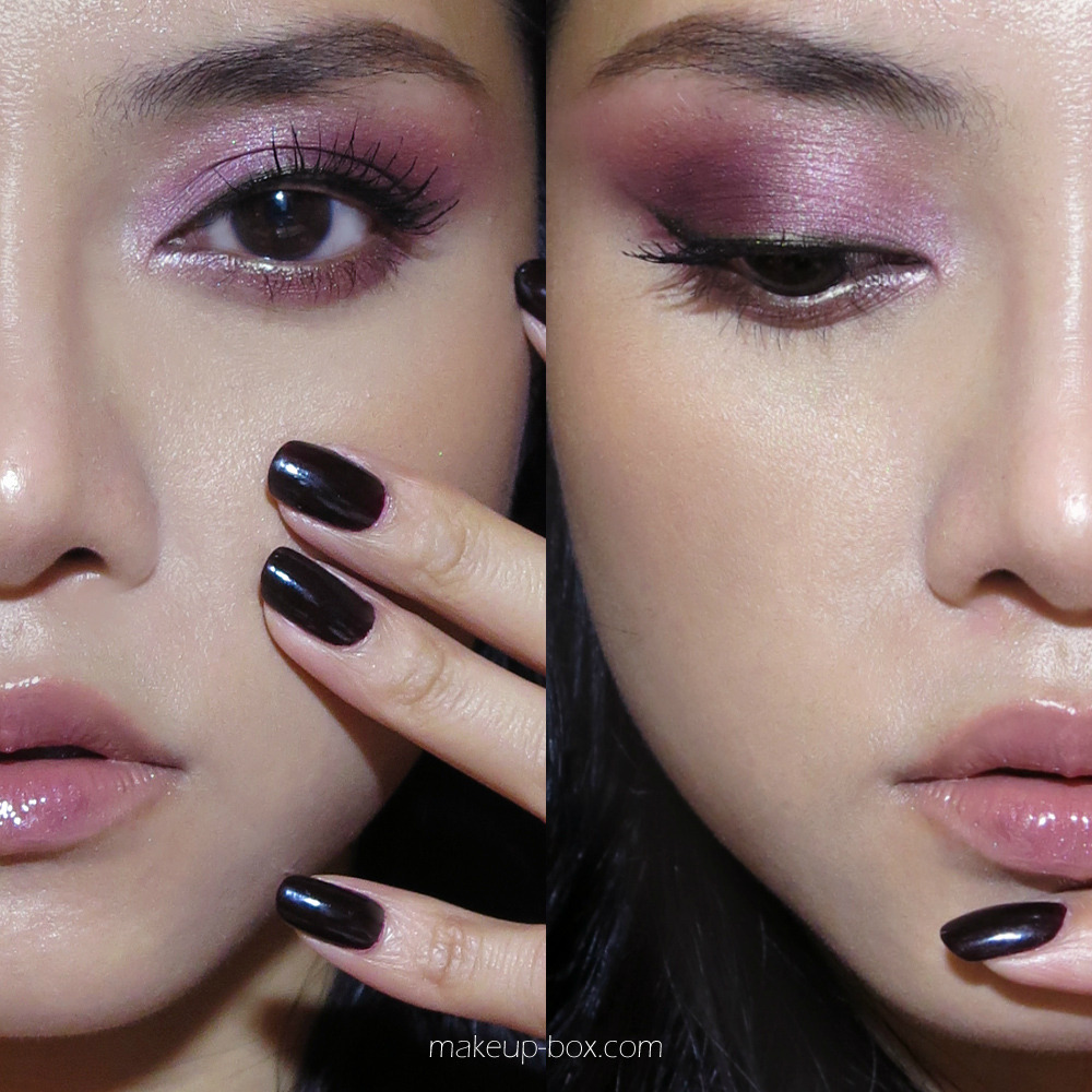
"Midnight Rose" Tutorial (Dramatic Pink/Plum Smoky Eyes using Givenchy Le Prisme Yeux 71 Purple Show)

Rosy pink tones are not typical colors for the eyes, because it can go so wrong and make your eyes look tired and swollen. Do it right, and it can be pretty and dramatic with a slight “goth”/gothic feel.

Here are a few tips:
  • Make sure you conceal any unevenness and redness in your skin. Rosy shadows will bring those out, and make them more obvious. 
  • Blend a rose colored shadow with softer, more pastel tones AND make sure you ground it with dark definition at the lash line. 
  • One other trick is to use a bit of liner in a contrasting tone (I used an olive-bronze pencil since there are so many red tones and green is on the opposite end of the color wheel). A brown or plum pencil complements the rosy shadows better but they would fade right into the background instead of standing out.
  • Pair it with soft blush and neutral/nude lips. Rose everywhere can look quite scary and over the top.

Products used:
  1. Foundation: Makeon Chokchok Shining BB Cushion (smoothed on with fingers)
  2. Concealer: MAC Studiofinish Concealer in NW20
  3. Powder: Bourjois Poudre de Riz de Java
  4. Contouring: The Body Shop Matte Bronzer 01
  5. Blush: Benefit Rockateur (I keep using this recently; it goes great with most looks…)
  6. Eyeshadows: Givenchy Le Prisme Yeux Quatuor in 71 Purple Show (it says purple, but the colors are more rosy-plum)
  7. Liquid liner: Givenchy Parad’eyes Liner in 1 Dream in Black
  8. Pencil: Givenchy Magic Khôl in 5 Bronze
  9. Mascara: Givenchy Phenomen’eyes Waterproof in 1 Water Black (this is fantastic for very separated wispy looking lashes and good lift because it catches every lash)
  10. Lipstick: The Body Shop Colour Crush lipstick in 220
  11. Lipgloss: Clinique Long Last Glosswear in 18 Mystic (a purple grape). This was applied just around the center of the lips for some dimension. 
  12. On nails: Lancôme Rouge Reglisse, which is a dark blood/red but looks black here.)

Thursday, March 7, 2013

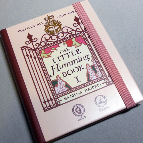
Majolica Majorca Humming Book I (Swatches, Review, 2 Easy Looks and how to dupe the product!)


I think Majolica Majorca has fabulously silky and pigmented eyeshadows. But I'm not a fan of palettes where there are a mixture of cream and powder products. Creams have different shelf lives from powders and the lip cream is most likely going to go bad before the other stuff. Also, when powder gets into cream and vice versa, everything gets ruined. 

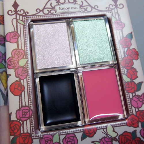
BUT, when I saw this charming little "song book" in their latest limited edition collection and tested the 3 shadows (1 cream base and 2 shadows) alone and over one another, I concluded it was so brilliant I had to pick one up.

 
Concept:
The collection is centered around a dreamy, lyrical flower garden, and the combination of shades gives you exactly that sort of look. Now you CAN possibly use each of the colors alone, but I personally wouldn't do that. 
Alone, the 2 pale shadows can look a little washed out and not flattering if you don't have a very defined and deep socket. The cream base on its own, does not set and will shift, smear, and crease. The genius is in the combination when the pale duochrome shadows hit that dark blackened plum. You get the most beautiful soft-focus pearl finish.
The petal-pink lip gloss I couldn't care less about. It looks nice in the pan but applies streaky, lacks pigmentation, isn't flattering on its own, and all in all, you're better off getting Revlon Lip Butter in Strawberry Shortcake.