Contrary to popular opinion, I don’t find most purples to be that easy to wear on a day-to-day basis.
It has always been one of my favorite colors growing up, so you can bet I will have way more purple items lying around than I actually would wear.
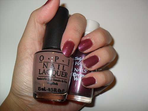
One of these is Sally Hansen’s Grape Fizz polish. I loved how it looked in the bottle, but was terribly disappointed when I got home, applied it, and found it to be a really sheer purple “stain” rather than the rich metallic hue I had hoped it would be.
So it sat on my shelf for months.
Until I suddenly thought about layering it with a deeper creme color.
Enter my trusty chocolate milk polish, O.P.I.’S Over the Taupe. This sassy sister’s apparently also a team-player. Worn under Grape Fizz (below), it was sufficient to bring out all the rich wine-grape tones without actually turning everything brown.
It’s now just a lovely plum/grape color.
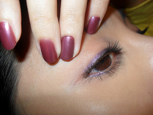
Of course, now that I found a way to make my Grape Fizz work, I had to get some sort of theme going on my face. I’m not crazy about matching, so much as complementing. So I reached for one of the very few items in my stash which I consider to be fool-proof.
The dark prune metallic pencil (#79 Violet miroitant) from the Bourjois Regard Metallise line. The brown, blue, green and black liners in this collection get a lot of press, and honest to goodness, I love and own them all.
But I find the true MVP for the collection; the one that I can reach for when I’m feeling totally lazy (like today), need to look work-appropriate, but want a little more zing than the usual blacks, navies and browns can give, is the purple.
In real life, it appears a lot more brown/gray, but I like how it’s dark enough to define or create a smoky look, while having enough color to still be interesting.
Other products worn in the photo above:
Rimmel Sexy Curves mascara
Revlon Colorstay #310 mixed with L’oreal UV Perfect SPF30


This information should reach more people. Erica
ReplyDelete