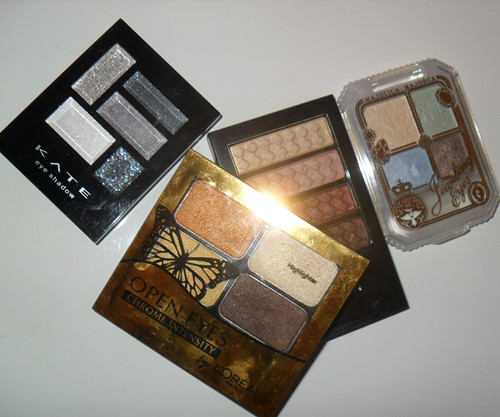
1. IF 3 OUT OF 4 SHADES ARE LIGHTER THAN YOUR SKIN, DON’T BUY IT. (Unless you have really deep skin tone, in which case it’s fine as long as the undertones of the shades aren’t all “white/pearl”.)
Too many women gravitate towards pastel palettes where most tones are pale. On the lids, all the pastels will just blend into a single. unflattering wash of contour-less pearl because there’s too much white in each shade for any real contrast in tones. Unless you are ultra-fair or have ultra pronounced bone-structure which you’re trying to minimize, this is just NOT for you.
The best palette should have a mixture of dark, medium and light colors. More dark than light has always been more flattering.
---
2. THE DARKEST TONE SHOULD BE AS DEEP AS AN EYELINER.
Just because the darkest tone in the palette is deeper than the lightest does not mean it is deep enough to define your eyes. And a good palette should allow you the choice of completing your look with just some mascara, and no separate liner.
---
3. DON’T TEST COLOR PAYOFF ON YOUR FINGER TIPS ONLY.
What you see there is not what you get. Try swatching that finger-tip onto the back of your hand. Layer a second time if needed. If that’s the color intensity you want, get it. Sometimes the heat, moisture and oil on our fingertips creates a great “base” for color to cling to, so it is not totally indicative of what the shadow would look like on your lids.
---
4. MIX IT UP.
Often, mixed-color palettes (cools with warms, or other contrasting textures and shades) are more fun and versatile to work with than color-coordinated palettes (e.g. 4 same shades in different gradations).
I mean - how many different looks can you do with 4 shades of purple?
---
5. DO THE UNI-SHADE TEST.
A lot of times, we buy a palette only to end up using particular colors in them rather than all. If in doubt, swatch and mix all shades on a single finger tip and apply that to the back of your hand. If that happens to be a color you would wear, then chances are you’ll get maximum use out of the palette.
---
6. Lastly, IT’S NOT HOW IT LOOKS IN THE PALETTE. IT’S HOW IT LOOKS ON YOU.
Don’t be fooled by pretty color-combinations that only look nice in the palette. As we know, many times they don’t look all that good on the face.
Such details in the articles are very much needed. londonescortsgroup.com
ReplyDelete