Showing posts with label bronze eyeshadow. Show all posts

Saturday, March 16, 2013

Blue Lagoon Tutorial: Color-block Eye Look with Nude Lips


I got a request recently for looks to wear with nude lips.  One fun option is to wear a colorful eye look with it, because you can get away with a lot more colors on the eyes than you would if you were wearing a stronger lip color.
I'm placing 3 strong colors side by side (coppery-bronze, a golden-aqua, and a vibrant purple). 


You will need:
  • A navy base - I used an old Sasatinnie blue gel liner, but any metallic pencil would work.
  • A bronze/tan shadow - I blended a whole bunch of peachy tan browns from the 88 Warm palette but you can just use any brown soft tan shade you have.
  • A medium blue-green shimmer - I used Lakeshore by Coastal Scents, which reflects gold. You don't have to use a duochrome like I did. A nice strong aqua or teal would work just fine.
  • A strong, bright grape - I used a Coastal Scents hot pot again, in Amethyst.
--
Read on for the tutorial!

Monday, May 28, 2012

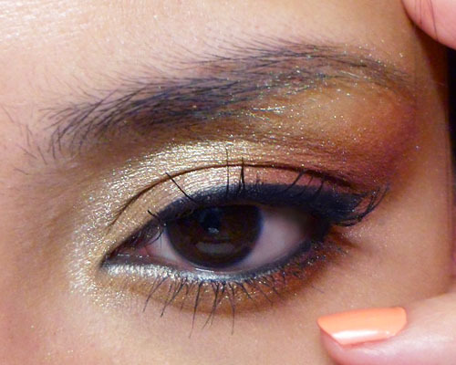
Golden Bronze Cat Eye Tutorial (88 Warm Palette)


My 88 Warm Palette has been in cold storage lately, as tends to happen when you are always trying new things. This is a look you don't need the 88 palette to create, as there are lots of similar shades in other palettes as well. 
The shades you'll need to pick are
  • A soft beige- or malt-gold that isn't too far off from your skin tone
  • A warmer, stronger amber-gold with some orange in it
  • A soft burgundy with a pearl sheen (surprise; this gives the whole look more depth than just sticking with a deep bronze or brown)


Step 1: Apply the soft gold all the way from inner corners up to the brow bone, leaving just the outer-most corners of the eye clean.


Step 2: Pack the warm ambery gold onto the outer 1/3 of the lid below the socket, and then extend up to the brow bone. Notice I extended the color inwards more along the deepest part of the socket line. This will give your eye more definition instead of allowing all the bright colors to wipe out your contours.


Step 3: Pick up a warm, rich burgundy and pack that right in the outermost corners of the lid, then also lightly sweep the remaining pigment on the brush up towards the end of your brow as well. This will make the look a lot richer and stop the eye look from going too brassy and yellow.


Step 4: Apply a black pencil along the tightline and waterline, and then use black liquid or gel liner to apply a thick flick at the outer corners. Finish with black mascara.


The finished effect is polished, dramatic, but at the same time not over-the-top because it should work with your natural skin tone. You can choose to pair this with a strong lip, but I prefer just going the natural route with this.
On Rest of Face:
  • TheBalm Hot Mama blush (my favorite warm coral blush)
  • NYX Iced Honey lipstick (metallic beige/nude)
  • Revlon Super Lustrou Lipgloss in Coral Reef (sheer coral creme)
*Quick tip: Applying a creme gloss over a metallic or pearly lipstick is a way to juice up your pout without adding a lot of obvious shimmer and sparkle.

Wednesday, October 19, 2011

Featured Shade: Matte Purple Shadow

Colors to pair a matte purple shadow with!

A good matte dusty-purple is hard to find. Purple is one of those colors that I find to be more flattering in a matte or satin finish. Sparkly or metallic purple can look a bit too garish for work and school, but a dusty lavender grey is a much better option.

My favorites are Everyday Minerals Matte Eye Shadow in Tide Pool (limited edition, unfortunately), and Urban Decay Matte Eyeshadow in Cult (slightly deeper purple). This is a quick run down of some foolproof shades to pair matte purple with.

Everyday Minerals Tide Pool Eye Shadow (Matte)


Purple on Purple: Pale silvery-purple with a deeper smoky purple look great together.  Swatches: MAC Crystal (left), and Tide Pool (right)

Champagne and Purple: The contrast of a pale glimmering gold with a smoky purple is gorgeous. Swatches: MAC Retrospeck (left) and Tide Pool (right).

Chocolate and Berries: Nothing goes with purple as well as a rich cocoa when you want a more sophisticated look. Swatch: MAC Cement (left), and Tide Pool (right).

Bronze on Purple: For instant drama, an ambery, metallic bronze shadow or glitter  paired with a matte purple  can really play up your eyes.  Swatches: NYX Pearl Mania in Oro Pearl (left) and Tide Pool (right).

Monday, February 28, 2011

My Eyeshadow Palette


My I Nuovi Eyeshadow Palette is not your usual plastic palette. It's a lovely black "leather" magnetic palette with24 slots for 26mm eyeshadow pans.

And nope, it’s not filled with MAC. I don’t have access to MAC PRO stores where I live, and I really can’t bother getting crazy with wire cutters and heating contraptions in order to transfer the ones I own.

This baby is filled with eyeshadows I actually can depot without lethal weapons. The Body Shop and I Nuovi shadows are some of the best ones around, in my opinion. TBS is especially rich and creamy-feeling, so i you like soft shadows similar to Urban Decay's ion texture, go for them.

I Nuovi is similar to MAC in terms of cost, color range (a mix of vibrant metallics, pearls, glitters and matts), and quality, but not readily available outside of some Asian countries. The price on the web is also high compared to their retail stores, so I can't say I'd recommend rushing online to get them if you can access MAC shadows where you are.


This case though... the gorgeous case...
The only reason I don't have more than 1 is because I don't have enough de-potted eyeshadows to fill them.

What's in YOUR eyeshadow palette?

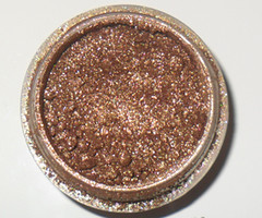
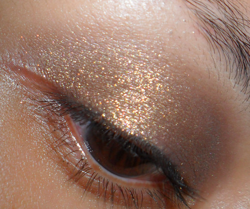
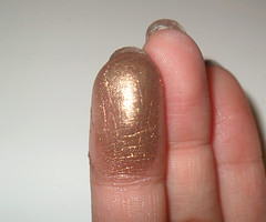
Home-brew: "Goddess" pigment


Who says brown is boring?


Meet my favorite custom-blend pigment, which I’ve named “Goddess”. It’s earthy, but it’s a strong, gold-flecked high-sheen metallic brown which is never boring to wear.


In fact, it’s not always appropriate for the day, especially if you work in a more formal corporate environment where too much sparkle is frowned upon.
Ah, well… I’ll look forward to the weekends.

I mixed this up on a whim and then realized I didn’t note down what pigments I used and in what proportion, so now I’d be very hard-pressed to replicate this ever again.
Woe, me.