Showing posts with label tutorial. Show all posts

Tuesday, April 28, 2015

Sparkly Cobalt Blue Eye - with and without Freshlook Grey Colorblends


People often ask me what eye makeup works best with what colored lenses or what colored eyes. I personally don't believe in setting rules because as long as you're wearing black liner and mascara, there is often enough of a contrast that your irises will stand out anyway.

There's also the other question of color theory. We are told by magazines and beauty writers that if you have blue eyes, you should never wear blue eyeshadow. That only coppery browns and other warm golden tones will bring out your eye color.

BS. The softer blue than your eyes can bring out the blue. A good black liner will DEFINITELY bring out blues. You can generally pull off most shadows if:
  1. you have some black liner and mascara around the lash line to "separate" the shadow from your eyes. This helps both the shadow and your iris to stand out. 
  2. the limbal ring around the outside of your iris (or your lens) is quite dark/defined. This creates definition, and makes the color pop more than someone whose iris is very pale through and through.
But ultimately - who wants to stick with one color group for their entire life just because someone said "it will bring out your eyes"? What if it doesn't work with your hair color, your skin tone, your lipstick, your outfit choice? Will you wear a shadow that looks terrible JUST because it makes your eye color pop? Don't listen to those clichés, my dears. 

Your eye color should never be the sole deciding factor dictating what eyeshadows you can or cannot wear.
Freshlook ColorBlends in Grey

That said and done, I personally prefer natural eyes, just because most lenses tend to slide around a bit and don't stay perfectly centered all the time. When the "pupils" aren't exactly in the right place on both sides, your eyes look off-focus, and you get that glazed, lazy-eyed "zombie" expression. 

Of course, when it works, it really looks good too. You decide!


The look I have here was done with few key items from INGLOT's limited edition Mamma Mia collection. Don't get me started on the name and the packaging because I really don't see how these edgy pop-art colors are related to Mamma Mia in any way.

But if you love bright strong colors and looks, this is a collection you should check out. Weird packaging aside, they have a 10 color palette featuring an entire RAINBOW of shades. I have it below, placed next to my own custom palette with neutrals and mauve tones. The shades I used are marked out. I don't have the numbers for the Mamma Mia palette, but you can look for similar ones in the regular range.


Another 2 key items you have to check out would be the AMC Eyeliner Gel in 103, also from the collection. This is a vibrant metallic blue that's the cream version of MAC's Freshwater shadow. I.e. royal blue perfection.

And that Body Pigment Powder 313 is a deep rich sparkly cobalt to die for. I'm going to be layering all these things today.


Steps are all listed below, and you can click to expand to full size if you want!
I do want to remind you - there WILL be a lot of fallout as we're working with dark shades and loose pigments. If you don't want to make a mess, make sure you do your foundation and concealer AFTER you finish your eye makeup.


INGLOT Duraline is one of my favorite products of all time. It's a sealant/converter that turns glitters and pigments into a cream. But it's not watery; it has a dry oil-like feel so you get enough time to blend and smooth things around, before it sets and locks down for the rest of the day. 


Tip: Press on the first coat of sparkly pigment first, let set, then go over with another coat. The first layer sinks into the liquid and grabs, so it's never as shiny. The second coat will give you maximum sparkle.

I used Bobbi Browns' Black Ink gel liner here.

Voila!


Monday, February 16, 2015

MAC Toledo Makeup Look: Moodyblu Palette and Oxblood Matte Lipstick (plus Toledo swatches part 2!)


MAC x Toledo is one of the most colorful collections of the season, with lots of intense blues, violets, lime greens, violets and rich deep reds. So it was a bit of a challenge for me when I decided I wanted to create a softer, more wearable everyday look with some of the items in the collection.
It's quite wearable and neutral for the most part, but I chose to keep a pop of very intense blue around the outer corners of the eyes for a bit of interest, and to define and draw attention to them. (There wouldn't be a point in doing a look with the Toledo collection if it was going to look like any other neutral collection!)
The star of the show here is really the sparkly metallic blue eye pencil, Petrol Blue. I highly recommend you check it out if you like colored eyeliners and want buttery smooth texture and intense payoff. The lasting power is pretty darned good as well, but of course, I had to intensify it and lock it down by dabbing a matching blue shadow (Deep Truth) over it. 


 And Oxblood matte lipstick? It's a fab, FAB kittenish peachy-beige. Not quite nude, but very pretty if you want something muted with a bit of color.

The surprise of the look for me was Azalea Blossom, the pink-purple blush ombre. I'd expected a very cool-toned shade but over my skin, the blend of pink and purple went on quite a bit warmer. If you're looking for a sweet pink flush, this is great. If you were expecting a very purple hue, you might not get it if you have a yellow undertone, or you're wearing a bronzer beneath.


MAC Azalea Blossom goes on surprisingly neutral on top of bronzer


Speaking of blush, I do owe you all the swatches for Ripe Peach Blush Ombre from the Toledo Collection, which was missing from the first delivery. Here it is.


I was also missing Victoriana matte lipstick in the swatches, so here it is swatched beside 2 other true reds. Tenor Voice is the true red in the Toledo collection, and Victoriana is a cherry red with slight pink undertones. 


Here, the 2 shades are swatched beside Carmine Red from the MAC Prabal Gurung collection, which is another vivid red. On first look they all look identical, but the difference is in how they sit against the skin. 

Tenor Voice casts neither a blue nor an orange border against the skin, while Carmine leaves a blue border. Victoriana has a rosy hue. This is how you check undertones of reds. And when picking one, look not at the color itself but how it makes the surrounding skin look. The best red for you, is one which brightens your skin and makes it look more glowing and even. 


Tuesday, February 10, 2015

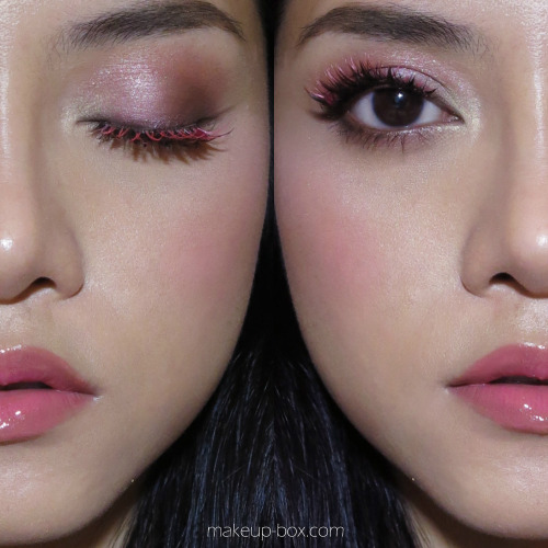
Tom Ford Spring 2015 Eye Color Duo Eye Looks


Tom Ford's Spring 2015 eye makeup colors are iridescent, rich, mysterious and smoky. Similar to what we saw on the Tom Ford runways, these eye color duos will give you intense smoky rock'n'roll eyes. But despite how pared down and possibly dull they look in the pan, they are actually very pretty on the lids. 

This is because each of the 3 duos, Raw Jade, Ripe Plum, and Crushed Indigo, have a white "interference" shadow paired with a deep jewel-tone. This interference shade shifts to a duochrome pearl color when applied. 

In Crushed Indigo, it is an icy blue, in Ripe Plum, a sugary pink, and in Raw Jade, a mint green.

Tom Ford Spring 2015 Eye Color Duo duochrome swatches


Out of the 3, I had the opportunity to pick out 2 duos to try out for myself, so I went with Raw Jade and Ripe Plum, just because they looked more unique to me.


All I did for these eye looks is apply the dark shade to most of the lid, smoking up to the socket line, and running along the lower lash line as well. Then I packed the pale iridescent "white" shade into the inner 1/3 of lids and along the lower lash line. 

To finish the look, I went with what the models wore on the runway. Black khol along the inner rims of their eyes, and lots of black mascara. 

Tom Ford Spring 2015 Eye Color Duo in Ripe Plum
As you can see, the shadows look quite different on the lids from what you might think in the pan. They are very rich and dimensional, and easy to blend, as with all Tom Ford shadows.


Ripe Plum is the closest to a smoky neutral out of the 3 because the deep burgundy is very brown. But once the shimmery pink iridescent shade goes on, the whole thing transforms to a gossamer pink/plum.


I do love all 3, but I daresay I'll get the most wear out of Ripe Plum. I do love a rich wine-brown eye as an alternative to the standard neutrals. 

To recreate the look, just follow the simple steps below!

Step by step guide to achieving this look with any of the 3 palettes!

Sunday, November 24, 2013

Glam smoky toffee-gold eyes with tawny-nude cheeks and lips

This look works like the classic smoky eye, with
  • the lash line being the darkest and most intense
  • color fading as it goes outwards
  • smoky shadow blended quite far down along the lower lash line
 The rest of the face is very monochromatic, with nude tones on the cheeks and lips, topped with a little warm gold-toned sheen.


Very into smoky neutrals right now, and it’s great for the holiday season because they’re flattering for everyone, go with most outfits and are a quick way to add some glamour to the face.


Skin:
Maybelline Pure.Eraser Mineral Foundation OC2
The Body Shop Concealer Pencil 02
ClearLast Face Powder in Medicated Ochre (this is a range of pressed powders in different finishes by Mandom Japan that I love, love, love for setting makeup because they give additional coverage and don’t grab and darken over concealer, and also never look too matte or cakey).
The Body Shop Bronzing Powder in Light Matte 01 (for contouring)
The Body Shop Shimmer Waves in Coral for a soft sheen and a trace of warm color
Brows: 
Shu Uemura Hard Formula 9 Pencil in Seal Brown
Canmake brow mascara 01
P.S. sorry for the duplicate image in the pictorial image below!
Smoky toffee-gold eye pictorial

Eyes:
Instead of a typical pencil, use a soft black kajal or an intense black cream shadow stick like Bobbi Brown’s Long Wear Cream Shadow Stick (these are easier to smoke out)
Bobbi Brown Metallic Eye Shadow in 9 Burnt Sugar (or any caramel-toned brown that isn’t too shimmery)
MAC Pressed Pigment in Flicker (or Lustre shadow in Retrospeck) patted on with damp fingers for precise sparkle
Clinique High Impact Mascara in Black
Lips:
The Body Shop Colour Crush lipstick 220
Bobbi Brown High Shimmer Lip Gloss in Candlelight


Saturday, November 9, 2013

Pink or Black? Shu Uemura Holiday 2013 Pink and Black Palette tutorials

Shu Uemura Holiday 2013 Face/Off: Pink Princess vs Black Princess looks
When we first saw the anime-inspired Pink/Black-split collection from Shu Uemura's 6 Heart Princess collaboration with artist Takashi Murakami, it was a natural to start thinking of doing pink vs black princess looks.

I've done just that, and you can choose for yourself which suits you more! (Or just go for both since the collection celebrates the duality in all women anyway. Full swatches and close-ups of the limited edition collection, including 5 lip and cheek creams and 2 pairs of premium lashes, are available here!


Shu Uemura 6 Heart Princess Heart-full Pink Parallel Palette makeup
To view the Pink Princess palette and tutorial, click here.
http://www.makeup-box.com/post/65950065810/shu-uemura-pink-princess-look-6-heart-princess

Shu Uemura 6 Heart Princess Enchanted Black Parallel makeup look
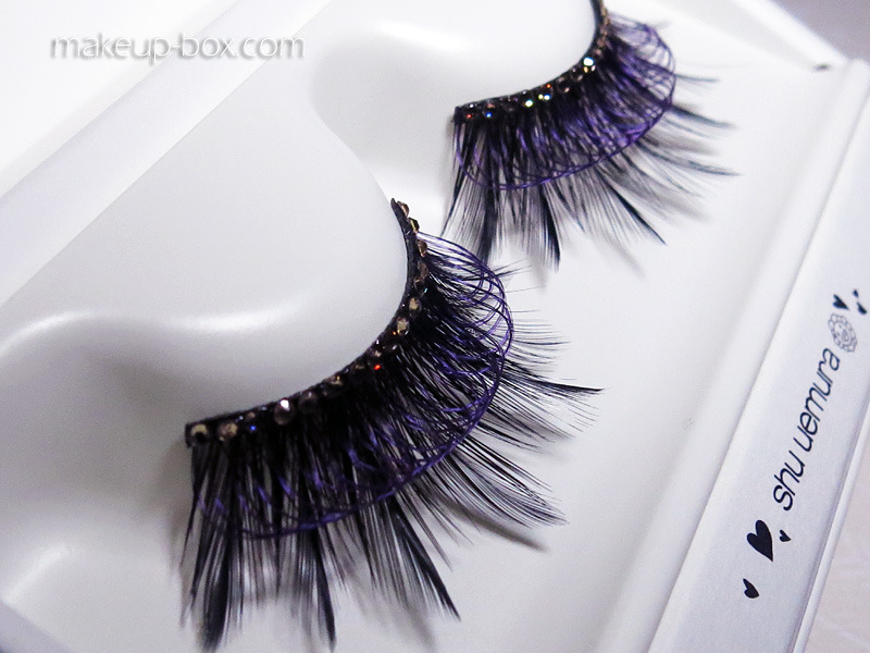
The Black Princess look isn't as dramatic as it should be, because I used Katy Perry Ka-Pow lashes instead of the jeweled, feathered, cobweb-like premium set from the collection. (They were too large to fit my eyes, and I wasn't about to cut up $125/pair lashes.)

Shu Uemura 6 Heart Princess "Black Jewel on Wing" premium lashes
This post will be updated with a link to the full Black Princess makeup tutorial shortly!

Monday, October 8, 2012

Statement Metallic Ombre Lips (Chinese Festival Colors)


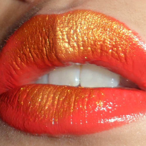
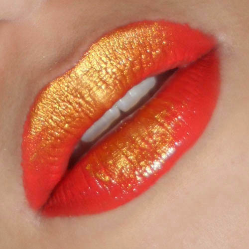
This is a fun tutorial with a twist on the "traditional" ombre lip using a metallic pigment. You can choose any colors you want as long as they sort of stand out from each other. (Test on the back of your hand to see if you like the effect.)
Just because this is the Mid-Autumn Festival period for many Asians, I went with a nice coral red (Revlon Ravish Me Red) and a bright amber-gold pigment (Coastal Scents mica in Metallic Rustic Gold).
The only other things you'll need are a flat eye brush that isn't too small, and Q-tips in case you need to clean up any mess.


Step 1: Simply slick on your lipstick as neatly as possible. Matte lipsticks will allow the pigment to "float" and be more obvious. The glossier the lipstick, the more the pigments will sink into the moisture (and look dull).
You can still use a creamy lipstick. You'd just need to layer on more pigment.


Step 2: Using your flat brush, press one side of it into the pigment and then tap the brush to remove any excess. If you don't, all the pigment is going to end up on your chin. Not very sexy.


Step 3: The 1st step to laying down the color is to gently pat a thin layer of pigment onto the top lip. Go from center outward one side at a time, so that most of the pigments will be concentrated in the center. The first layer you lay down may not be very vibrant and opaque, but don't worry about that.


Step 4: This is where you pack a 2nd layer of color down the center of both top and bottom lips. On the top lip, this should give you that nice ombre effect where the gold is most intense in the center and then slowly fades out into the red.
On the bottom lip, I wanted more dramatic contrast (like gold foil pressed onto the lips), so I only pressed the brush down around the center. No ombre, no fading outwards like we did with the top lip.


If you need to, use a Q-tip to carefully clean up the edges if your lip, but if you didn't pick up too much pigment earlier, you shouldn't need to.
Now all you need is minimal makeup on the rest of your face, and you'll have the most vavavoom lips at the party! (Just be very careful about eating and drinking.)