Showing posts with label drugstore makeup. Show all posts

Sunday, August 9, 2020

Maybelline Super Stay "Rogue Reds" Matte Ink Edition: Brick Mask-Proof Lipstick Swatches


Very quick post just to share swatches of the Maybelline Rogue Reds color expansion for their Super Stay Matte Ink line, in case any of you were looking for color-comparisons now that there are no swatch testers in store.

Brick is not only perfect for Fall 2020, but great year-round as well. The combination of reds and browns makes it more forgiving than bright red, and not as dull as brown. But this collection isn't just red-brown. There are some interesting burnt peach, burnt orange and sun-dried tomato tones as well, like 300, 285 and 315.

315 Extraordinary, the soft tomato red, is a particular fave of mine as it looks a little (a lot) like Armani's very pricey Lip Maestro in 405.

Maybelline Super Stay Matte Ink 315 an Armani Maestro 405 dupe? Not 100% but very close!


Wednesday, July 22, 2020

ZA Summer 2020 White Protector and Coming Journey Collections

ZA Coming Journey Lipsticks (Limited Edition)
Cosmetic giant Shiseido's drugstore line ZA is best known for its popular foundation and brow products. This year though, they've expanded the True White Protector primer line to include color correcting versions as well as a color-correcting finishing powder.

ZA True White Protector range
Priced at S$15.90 per 35g tube (about 1.2oz), the primer range is formulated with Hyaluronic Acid and vitamins C and E for smoothing antioxidant protection, so they are multi-tasking moisturizers, sunscreens and color correcting primers in one. I do have to say these were more pigmented than I expected as I'm used to tinted or "tone up" primers rubbing out to near-invisibility most of the time. 

Sunday, January 22, 2012

More Barry M Lip Paints!

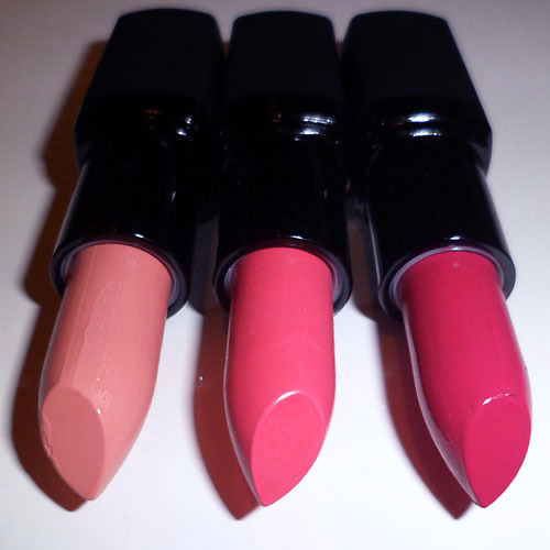
Barry M Lip Paints (L-to-R: 154 Pale Nude, 153 Pink Ribbon, and 145 Punky Pink)

My obsession with trying out more Barry M Lip Paints continues. (And aren't they gorgeous?!!)
I must say ordering online from Barry M is always a bit of a gamble, as you have no idea if what you see is what you'll get. It took lots of Googling to get a better idea of what each shade looked like. This time round, I picked out 3 shades when I placed an order for my Fuchsia Lip Pencils, and they are:


(Swatches L-to-R): Barry M Lip Paints in 145 Punky Pink, 153 Pink Ribbon, and 154 Pale Nude

154 Pale Nude (creme) - "Concealer-lips" nude with a slight peach base. Quite opaque, with a lot of white in the base so it may not be the easiest shade to wear unless you really like that sort of look.

153 Pink Ribbon (creme) - Bright peach/coral-pink; VERY similar to MAC Chatterbox and NYX Fig. Perfect bright pink for those who are looking for a warmer, more coral alternative to shades like Pink Nouveau.

145 Punky Pink (creme) - Rich, deep cyclamen-pink. Listed on dupe sites as a 100% match for MAC Girl About Town. This goes on a softer shade than it looks in the tube, so don't be scared by the color. It's not TOO magenta or blue-based, so it would be flattering on most people.

Each Barry M Lip Paint is £4.49.
As always, I'll be following up soon with more detailed posts on each of the 3 shades, swatched alongside other similar colors!

Sunday, January 8, 2012

Drugstore Fuchsias: Swatches and Tips for Application

Selection of  drugstore Fuchsia shades
Fuchsia is not a daily shade for most people, but there are some occasions when you want a strong lip and red is not always the easiest shade to get right. If you can't seem to get reds to work for your skin tone, or have the sort of face where reds just make you look a little aged or severe, a good alternative to try is a fun, deep, fuchsia pink.
Technically speaking, a fuchsia is a very strong and bright blue-based pink, maybe not so bright that it's highlighter-pink or so dark as to be called rose, but as we all know, what one person considers fuchsia can be very different from another's. I've chosen something of the middle ground where the shades are quite deep relative to other pinks, but still have a touch of bright blue tones to them.

Swatches L-to-R: Rimmel 220 Shocking Pink, Sephora R11, NYX Louisiana, L'oreal 288 Intense Fuchsia, and Revlon 330 Fuchsia
I own several of these deep, and the main difference between them are in the base tones (whether they lean more towards a hot red or towards a cooler magenta). Which to wear depends on your skin tone and preference. I am not one of those color nazis who will tell you that if you have "warm skin" you should wear "warm fuchsias". There's no such rule. 
Just note that a warmer red-fuchsia will tend to "fit in" better and look less bright, whereas a blue based one will tend to stick out more, regardless of whether you are warm or cool toned. This is regardless of your skin tone simply because a bright blue-pink is not a shade that occurs in nature and will provide more contrast. 

Of the shades I own, I probably wear Revlon Color Burst 030 Fuchsia most due to its good, creamy texture and the fact that it does not stain my lips. It's not the most opaque (L'oreal, Sephora, Rimmel and NYX matte are more pigmented) and it's an interesting blend between something with a rather warm red base tone, paired with a faint blue sheen which does not look like noticeable shimmer (thank goodness) but pulls the shade toward the cool side in some lights.

Revlon Colorburst in 030 Fuchsia
My latest acquisition is L'oreal's Intense Fuchsia, after I saw it on Gwen Stefani in the latest issue of InStyle magazine. But don't you hate how Photoshop and photography lies? It was nothing like the intensely blue-toned pink shown on the cover image. L'oreal Intense Fuchsia is more of a red-based strawberry fuchsia with a faint hot pink sheen (not too noticeable on the lips).
It's not that it isn't a nice shade, but you aren't going to get that glorious electric pink with a noticeable blue sheen that Gwen was sporting.
Texture-wise, there is nothing to complain about. I always found Colour Riche lipsticks to be very pigmented and lusciously creamy without being cheap and slippery. But beware that this lipstick stains big-time. This means that over the course of the day, your lipstick will start to look darker and more red, as the dyes color your lips more and more, and it starts to show up beneath the fuchsia. You'll end up with a bright strawberry rose, which is lovely, if that's the shade you're going for.

Rimmel Shocking Pink is similar to this deep red-pink shade, but is fully matte, and does not contain shimmer, so it will look a tad deeper when applied as there is no sheen or shine whatsoever.

L'oreal Colour Riche in 288 Intense Fuchsia
 NYX Louisiana is not technically a fuchsia by my book, but a lot of people describe it as a hot pink on review sites, so I thought I'd include it for comparison purposes, just to show you why I don't consider it so.
Compared to the other shades in the swatch image above, Louisiana is a lamb among wolves. It's softer, warmer, and has more noticeable deep-peach undertones although it's by no means a pale shade. If you're new to hot pinks or are afraid of going too over the top for work or school, this is a safe shade that will still stand out without being too electric.
The blend of pink, red and peach is also quite a flattering shade for most skin tones. Beware though, that the texture is the typical NYX texture which is not going to feel very rich and luscious. It's waxy and slippery, with a plastic taste, but at least for this particular shade, it doesn't look as cheap as it feels.
NYX Louisiana Round lipstick
 This brings me to one of my cooler fuchsias. Sephora's line of lipsticks are hits and misses for me. (Actually, more hits than misses.) It might not be considered a drugstore for most, but I included it as the price range is similar.
R11 (the case does not include the name... it's only labeled on the plastic seal, which is silly as you throw it out...) is a deep magenta pink which is probably closest to a true fuchsia tone. The coverage is opaque, the texture is very much like a high end lipstick, and the finish is creamy and moisturising. There is no shimmer whatsoever, so this is a true creme finish.
It also does not stain, so if you like cool toned shades, I highly recommend this.
Sephora Rouge R11
I had to throw in an honorable mention which I did not include in the swatches when I was taking the pictures.   I'm not sure why I forgot it when I was taking pictures in preparation for this post the day before. 
NYX matte lipstick in Sweet Pink is another true cool-toned magenta pink, even more blue than Sephora R11, but not electric bright.

It has a wonderful creamy-matte finish and is one of my favorite blue-based shades to wear, as it makes your skin glow and your teeth look whiter. If you're drawn to but still afraid of shades like Shocking Pink and Candy Yum Yum, you'll be happy to know that this shade is nowhere near as bright. And the opaque matte texture means it stays on very well.

The only minus to this affordable-but-expensive-looking shade is the scent, but hey, that's a small problem for a good lipstick.
NYX Sweet Pink Matte Lipstick
Application Tips:
The problem with wearing any bright lipstick for hours is the feathering and/or fading. It always look gorgeous when just applied, but after 3 hours of talking, drinking, or general wear and tear from pressing your lips together, etc, you will find the edges of the lipstick have smeared or feathered into an unflattering mess. 

Matte formulas can minimize the problem but they may not eliminate it unless the finish is very dry. And not everybody wants to wear a full matte lip.

This is what I do to keep everything under control when I wear a fuchsia lip (demo using Revlon Fuchsia) out for a full 12-hour day:

Step 1: Apply a lip primer over the lip line (I use POP Beauty's Lip Magnet, which is a very sheer beige that does not change the color of lipsticks), and rub with fingers to even out and remove access.

Step 2: Apply lipstick to the lip area, without going beyond your lip line. 

 Step 3: Gently kiss a sheet of tissue to remove the moisture and some of the excess pigments.

Step 4: Use a fuchsia lip pencil (NYX Fuchsia is great and affordable, but if you're particular about brands, MAC's Chromagraphic Pencil in Process Magenta is a great liner for most fuchsia shades), and lightly run in windshield wiper motions along your lip line. I say windshield wiper motion because you are not going to get a perfect line in a single stroke. You want to almost fill in the lip line with your pencil, so you create a thicker barrier around the edge of your lips.
NOTE: You can choose to fill in your entire lip with the pencil first, but I don't like to weigh down the color and texture of my lips that way, so I only fill in the outer edges.

Step 4: Reapply your lipstick as layering will intensify the color and shine, and lock it in.
Then with your finger, very lightly and gently dab along the outer edges of your lip line to remove any excess emollients. If you end up removing too much product, go back in and replace it with the fuchsia pencil. Not the lipstick.
Remember; the key is to keep the outer-most edges matte so the lipstick does not bleed over the course of the day. Dabbing just at the edges will help you to achieve that while keeping most of the lip looking glossy and moist.

For a day-appropriate look, I like to pair it with very neutral eyes and a soft pink cheek to keep the whole face reined in. 


Saturday, August 6, 2011

Wet n Wild Coloricon "Greed" Palette (Glam Look)


This is a second look featuring the Wet n Wild Coloricon Palette "Greed". Previously, I did a softer, more colorful look using the shimmery and coral-toned shades. This time, it's more a play on shapes and contrast than washes of color.


Step 1: Apply eyeshadow base over the lids, then black kohl pencil along the upper and lower lash lines. Smudge along the upper lids, and then re-line right at the root of lashes so it is darker there.

Step 2: Using a flat, firm brush, pack the matte black shade along the liner on upper and lower lids, and then extend outward in a wing. It should be thicker at the outer halves, and not too curved.

Step 3: Apply the shimmery coral in the lid area, not extending up past the socket line. Then use a small brush to blend matte coral along the outer half of the socket lines for some subtle contouring.

Step 4: Using a clean pencil brush, run the silvery-gold shade along the inner half of the socket line. This gives shape and very interesting contrast.

Step 5: Apply black liquid liner close tot he lash line, and then false lashes and black mascara to finish the look.


Monday, July 25, 2011

Dawn Storm: Wet n Wild “Greed” Palette


I’m a little late on the Coloricon train, but I finally got a few from Nonpareil.com, and I’ve been loving them so far.
The first one I decided to try was the 6-color #246 Greed palette, below. I think the shades are gorgeous. The pigmentation of the matte shades is higher on touch, but if you apply them with a brush, over primed lids, the metallics perform just as well, and are really gorgeous.


(Wet n Wild Coloricon 246 Greed)


One tip: Try to avoid applying or touching these with your fingers or you could end up hardening and “sealing” the metallic shades.

Click here for the step-by-step!

Tuesday, April 26, 2011

How to: Choose a Drugstore Palette


1. IF 3 OUT OF 4 SHADES ARE LIGHTER THAN YOUR SKIN, DON’T BUY IT. (Unless you have really deep skin tone, in which case it’s fine as long as the undertones of the shades aren’t all “white/pearl”.)

Too many women gravitate towards pastel palettes where most tones are pale. On the lids, all the pastels will just blend into a single. unflattering wash of contour-less pearl because there’s too much white in each shade for any real contrast in tones. Unless you are ultra-fair or have ultra pronounced bone-structure which you’re trying to minimize, this is just NOT for you.

The best palette should have a mixture of dark, medium and light colors. More dark than light has always been more flattering.

---

2. THE DARKEST TONE SHOULD BE AS DEEP AS AN EYELINER.

Just because the darkest tone in the palette is deeper than the lightest does not mean it is deep enough to define your eyes. And a good palette should allow you the choice of completing your look with just some mascara, and no separate liner.

---

3. DON’T TEST COLOR PAYOFF ON YOUR FINGER TIPS ONLY.

What you see there is not what you get. Try swatching that finger-tip onto the back of your hand. Layer a second time if needed. If that’s the color intensity you want, get it. Sometimes the heat, moisture and oil on our fingertips creates a great “base” for color to cling to, so it is not totally indicative of what the shadow would look like on your lids.

---

4. MIX IT UP.

Often, mixed-color palettes (cools with warms, or other contrasting textures and shades) are more fun and versatile to work with than color-coordinated palettes (e.g. 4 same shades in different gradations).

I mean - how many different looks can you do with 4 shades of purple?

---

5. DO THE UNI-SHADE TEST.

A lot of times, we buy a palette only to end up using particular colors in them rather than all. If in doubt, swatch and mix all shades on a single finger tip and apply that to the back of your hand. If that happens to be a color you would wear, then chances are you’ll get maximum use out of the palette.

---

6. Lastly, IT’S NOT HOW IT LOOKS IN THE PALETTE. IT’S HOW IT LOOKS ON YOU.

Don’t be fooled by pretty color-combinations that only look nice in the palette. As we know, many times they don’t look all that good on the face.