Showing posts with label turquoise eyeshadow. Show all posts

Friday, March 11, 2016

Oceanic Halo: TKB Trading Aquatic Blue Pigments


I'm a big fan of loose pigments, and I've mentioned TKB Trading a few times as being my default place to get supplies because of the big selection of colors, and the very reasonable prices. The pigments are sold for use in polishes, mineral makeup, and craft projects by indie sellers, so they are priced for bulk purchase.

You can get good sized 6g sample-sachets that fill up a disposable sample jar (more than typical MAC pigment jars with 4.5g) for just US$1.50 each. The only problem is you won't be able to decide which to buy.

The only thing to note is these pigments are raw ingredients. They don't contain fillers and additives, which can mean more intense vibrant colors, but also poorer adhesion and lasting power. I just get around that problem by using a good primer base or a mixing medium so the pigments stick.


When you dampen your brush with a drop of sealing liquid (e.g. Ben Nye, Mehron, Illamasqua, Inglot and more artist brands have their own versions of these) before dipping into pigment, and apply these like liquid shadows, you get incredibly intense color that is also budge-proof. You can't easily do that with powdered shadows because the liquids will seal the surface of pressed shadows and ruin them.

With loose pigments, you don't have to worry about that.


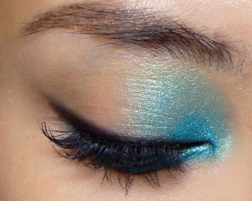
For this eye look, I was going for maximum pigment intensity, so I had 
  • a layer of black matte cream as a base all over the lids
  • a deep bronzer as a transition shade in the socket (don't feel you always have to buy a separate eye shadow pan - bronzer is more economical and multi-purpose)
  • a rich duochrome aqua blue with a green shift (TKB Trading Capricorn Sea, which is discontinued now - Indian Blue is a nice alternative)
  • a paler translucent blue with gold sparkle as a highlight shade (TKB Ocean Green)


A couple of tricks to getting a more dimensional look with loose pigments:
  1. Use a dark base - this helps grab pigments and intensify them; the only time to avoid a black base is when you are using a pigment that is quite translucent.
  2. Use a matte transition in a contrasting tone - here I used a very warm bronze to contrast against the blue and bring out the green tones more.
  3. Apply a first layer of the loose pigment dry, THEN foil a bit with a mixing medium and pack a damp layer of just inside the edges of the first layer as a liquid shadow, so the color goes from soft outside to maximum intensity in the center.
  4. The best highlight shade to complement an intense duochrome is one that echoes the color of the duochrome when it hits the light. In this case, Capricorn Sea has a pale aqua shift, so I picked Ocean Green to be the pale center shade for the halo eye look, and also to apply around the inner corners.


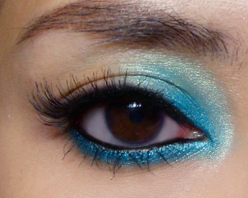
It doesn't really look like I am wearing 2 blues - the paler shade is there just to add more depth and complexity to the main turquoise shade.

Sunday, December 9, 2012

Fantasy Isle: Cat Eye with a Splash of Aqua


I was inspired by the recent Top Shop campaign visuals, where this girl was wearing BRIGHT aqua shadow all around the inner corners of her eyes, but since a big sphere of turquoise around your eyes doesn't really work in most real life scenarios, I toned it down a notch, stacked 2 liners along the lower lash line, and added a sultry cat eye flick into the look.
You'll need:
  • Black liner (any black kajal or pencil)
  • Aqua liner (I used Milani Liquif'Eye in Aqua but most brands have a bright turquoise)
  • A bright aqua shadow (I used Coastal Scents Hot Pot in Fantasy Isle; MAC Aquadisiac might work if you are extremely pale)
  • False lashes (or black mascara)
  • Black liquid liner (optional)

image
Step 1: First line your entire lower lid with the aqua pencil. You don't need to go all over the waterline. Just run it right below your lash line and then up to your upper lid, where you fill in just the inner corners.
Smoke out upper lid a little, so the blue fades into your skin.


image
Step 2: Use a fine brush to pack the aqua shadow over the lower lash line. This not only sets the blue, but also brightens it and intensifies the color.


image
Step 3: Switch to a softer blending brush for the upper lid and coat the inner 1/3 of your lids with the aqua shadow. Unlike the lower lash line, you are going to blend the shadow upwards, past the socket line and almost to the brow. 
Make sure there are no harsh edges. The aqua should fade into the rest of your lid.


image
Step 4: Use kajal or black pencil to line the inner rims of your eyes, inside the base of the lashes. 
Then run it above the upper lash line as well.


image
Step 5: Flick time! Run a Q-tip gently along the pencil above your upper lashes, and at the end, pull it up gently into a slight flick. If you smudged too much off, you can always go back and apply a little more black pencil JUST at the base of your lashes.
--
image
Step 6: Apply your mascara or false lashes. I used  Ardell 120 Demis here for a wispy, longer-at-the-outer-corners cat-eye look.


image
Step 7: (Optional) The shadow that we applied along the lower lash line earlier would have coated your lower lashes and made them blue and powdery. To get them inky and more visible, you can use mascara, but I find that tends to be clumpy, and if you're not careful, you can deposit globs of black all along your lower lash line from the brush.
I like using a liquid liner, holding it sideways like a mascara brush, and then lightly stroking it downwards to coat my lashes with inky black. Do it just like you apply mascara, moving from top to bottom, and be VERY careful not to touch your skin with the brush or felt tip.

 
And that's it!


Sunday, September 9, 2012

Paradise Colors: Summer-inspired Eye look


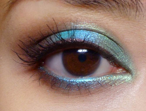
It's time to jazz things up with some brighter colors, inspired by the runways. I'm doing a tropical-paradise color scheme, with lush emerald green, rich brown, and a glowing turquoise.
You will also need a brown pencil for definition and an aqua/turquoise (optional) colored pencil to echo the blue on the waterline.


I used Coastal Scents Hot Pots on the lids and Bourjois pencils, but do use any alternatives you have. You can do a look with similar colors; they don't need to be identical.


Step 1: Instead of following the color-wheel (blue, green, brown), I wanted a little extra contrast by putting the brightest color in the center of the lid, where it will pop against the dark brown.
Apply along the inner 1/3 of the lower lash line as well. 


Step 2: Pick up the bright aqua or blue and pack it down the center of the lid. Don't blend it out too much as you want the color to be quite intense.
Apply the same along the center portion of the lower lash line.


Step 3: Pack the dark brown into the outer 1/3 of the lids, and then gently run it inwards along the socket line, until you reach about the center of the lids, above the bright aqua.
As before, run the dark brown along the outer 1/3 of your lower lash lines to finish.


Step 4: Here's the fun part. Run a brown pencil along the upper lash line for definition and some extra contrast against the aqua blue.
On the lower lash line, I actually used a bright turquoise blue pencil (Bourjois 54 Bleu Clinquant) to match and intensify it.

Then I finished with black mascara.


Wednesday, March 28, 2012

Cotton Candy and Chocolate: Defined Pastel Makeup Tutorial (using I Nuovi Dusts)


Pastels are all over the place this season. But more of us love pastels than pastels love us, as it's not always the most flattering color-group to wear around the eyes for those with high-color (dark hair, darker skins, etc) and flatter eye contours.
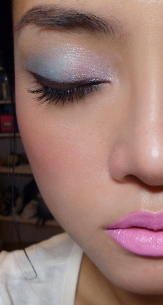
For this eye look, I'm using pastels that are so pale they are almost icy, and the application is actually very straightforward, as it hinges mainly on the chocolate powder liner to bring everything together. 
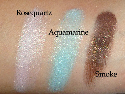
You just need to arm yourself with eye shadow shades similar to the ones swatched above. It doesn't matter if it comes in loose or pressed form.


  • Pale pink
  • Pale Turquoise
  • Deep chocolate brown

Step 1: The thick winged liner. This is MUCH easier to do with powder shadow than with gel or liquid, and you just need a firm angled brush to stroke from outside in, to gently create the wing. There are many brown shadows around, but pick a shade that is matte or semi-matte, to stand out against the pastels better.
---

Step 2: Layer  a pale turquoise shadow over the outer half of your lids. Then repeat using the pink on the inner halves, extending down around the inner corners slightly to brighten the eye area.

Step 3: Finish by applying another layer of brown shadow thinly as a liner at the lash line. This gives the brown more depth close to the lashes, while the bit that has pastel blue and pink shadows layered over it has a bit of sheen.
Then finish with black mascara on top and bottom lashes.


On the cheeks, go for a hot pink blush instead of a pastel. This keeps everything edgy instead of being just pastel everywhere. I used Shu Uemura P Red 14 Blush but any intense pink will do.
On the lips, go with a blue-based pink like Great Pink Planet (what I wore here) or Saint Germain (left-most swatches) to go with the shadows!